

About this collection
Every Fiverr gig lives or dies by a single image. Each cover here respects the real constraints of a gig image - one banner-shaped canvas, high-contrast text, and no clutter that would collapse at small sizes.
These are starting points, not finished listings. Every cover here is built around one idea: a single service promise, set in type large enough to survive being shrunk into Fiverr's search grid. The collection spans roughly thirty service areas — software and app development, design and branding, writing and translation, marketing, audio, data, and business consulting — so you can usually find a layout close to what you sell and adapt it.
Nothing here is a layered design file. Each one is a flat generated image, which is exactly what makes it quick: pick a layout, swap the headline, palette, and icons for your own service, and you have a listing image in a few minutes rather than an afternoon.
What a gig cover actually has to do
A buyer scanning search results sees your cover as a thumbnail no wider than a postage stamp, sitting next to a dozen competitors. That single constraint decides almost everything else:
- One promise, not a service list. "I will fix your WordPress site in 24 hours" reads at thumbnail size. "WordPress | SEO | Speed | Security | Maintenance" turns to mush.
- High contrast between text and background. Thin light type on a pale panel is the first thing to disappear when the image shrinks.
- Three to six words in the headline. Long headlines force small type, and small type is what becomes unreadable first.
- The service visible before reading a word. A layout cue — a device frame, a waveform, a chart, a colour swatch — tells the buyer the category instantly.
Resizing and export
Fiverr publishes its own requirements in the uploader, and they change - check them there rather than trusting a number quoted in a blog post. What does not change is the direction of the resize: always scale down from the download. Never upscale a smaller image to reach the uploader's width, because the text edges go soft, and soft type is exactly what a thumbnail cannot afford.
When you trim to match the uploader's proportions, do it symmetrically and keep the headline centred, so the crop does not eat one side of the promise.
Three things worth doing before you upload
- Judge the thumbnail, not the full-size file. Shrink the preview down to search-result size, or just squint. If the promise still reads, the cover works. 2. Keep a colour system across your gigs. Buyers skim a grid of near-identical covers; a consistent accent colour makes your listings recognisable among strangers. 3. Leave the outer margin clear. Gig images get cropped slightly differently across placements, so keep text away from the outer edge of the canvas.
Common questions
Will the downloaded cover meet Fiverr's upload requirements?
Check the uploader: Fiverr shows its current accepted format, file limit and recommended image spec there, and those are the platform's requirements, not ours. What matters on this side is direction — start from the downloaded cover and scale down to fit, never up from a smaller file.
Will the text still be readable in the search grid?
Shrink it to search-result size before uploading. That is close to what buyers actually see when comparing gigs, and it is where most covers fail — usually because the headline was set too small or the contrast was too low to begin with.
How many images should one gig have?
Fiverr's gallery takes up to three images and two videos. Lead with the strongest cover, then spend the remaining slots on a work sample, a before-and-after, or a deliverable preview rather than more headline art.
Can I use the same cover on several gigs?
No. Buyers often see two or three of your gigs together, and identical covers make them look like one listing repeated. Change the headline, the accent colour, and the main visual so each gig reads as its own service.
Can I change the text or colours after generating?
Not in place. The wording is baked into the image, so there is no text layer to retype. Download it and edit it in your own tool, or use the "Use as Template" option to regenerate it with different copy.
Why do the covers in this collection look so different from each other?
Because the range is deliberately broad. Each cover was written around the specific service it advertises, so a logo animation cover and a translation cover share a job — selling one service at thumbnail size — but not a visual style. That variety is what lets you give every gig a distinct look.
![[Format]
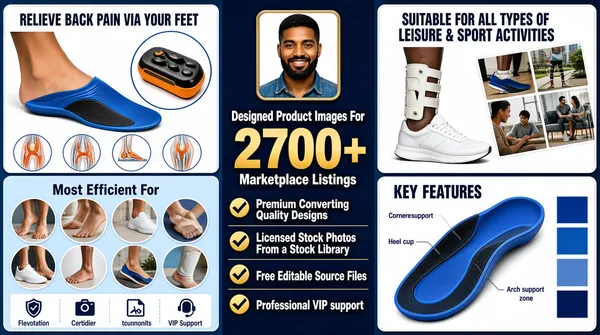
Landscape 16:9 gig cover, dense e-commerce infographic sheet. Flat vector-and-photo hybrid, very high information density, navy and gold palette. No watermark, no personal names.
[Layout]
The frame divides into three vertical zones. Zone A, the left third, stacks two white rounded-rectangle infographic cards: the top card is a blue-tinted product hero showing a foot wearing a blue-and-black arch-support insole with a circular inset detail of the insole, a small orange-and-black foot-massage device at the corner, a horizontal row of four small circular injury diagrams and a four-column caption strip along its base; the lower card is a pale-blue grid of circular photos of feet and legs around a centred heading, with a four-icon benefit strip beneath. Zone B, the middle third, is a solid deep-navy panel: a small rounded-square framed photo of a smiling man in a denim shirt sits at the top centre, three centred lines of type follow, then a vertical stack of four bullet rows each led by a bold gold check mark. Zone C, the right third, stacks two more cards: the upper one pairs a photo of a white trainer and a braced leg with a diagonal collage of four small lifestyle photos; the lower one is a blue product render of the insole with thin leader lines to four callout labels and a column of rotated blue colour swatches.
[Subject]
One small human subject: a young bearded man with dark skin and a denim shirt, smiling at camera, head-and-shoulders, cropped into a rounded square about one tenth of the frame width at the top of the navy middle column. Incidental partial figures - feet, legs, a seated person - appear inside the circular insets.
[Headline]
Reading order: card headings set in a condensed white or navy sans - "RELIEVE BACK PAIN VIA YOUR FEET", "Most Efficient For", "SUITABLE FOR ALL TYPES OF LEISURE & SPORT ACTIVITIES", "KEY FEATURES". A short lowercase two-tone wordmark sits in a white capsule at the top-left of the upper-left card and is repeated on the other cards. The centre column carries the main headline: "Designed Product Images For" in light amber sans, then "2700+" as a very large bold gold numeral about a third of the column wide, then "Marketplace Listings" in amber, the three lines centred and stacked. Four white sans bullet lines follow: "Premium Converting Quality Designs", "Licensed Stock Photos From a Stock Library", "Free Editable Source Files", "Professional VIP support".
[Badges]
One recurring mark: a short lowercase grey wordmark in a white rounded capsule roughly one eighth of the card width, its final letter replaced by a small blue kite-shaped glyph - describe generically, no readable brand. Also present: four gold check marks, four small circular anatomy icons and a four-icon benefits strip.
[Mood]
Corporate blue-and-gold: deep navy, cornflower blue, white cards, amber and gold accents. Busy and sales-floor loud; at thumbnail size the navy spine of type reads first, flanked by two columns of white cards.](https://files.posterlet.com/assets/generated/md/qecdsexqtbf0.webp)
![[Format]
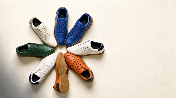
Landscape 16:9 gig cover, clean top-down e-commerce flatlay still-life photograph. High-key commercial finish, crisp leather and rubber texture, true-to-life colour. No watermark, no personal names.
[Layout]
A plain off-white seamless paper sweep fills the entire frame edge to edge, with no horizon line and no reflection. Seven low-top court sneakers are arranged top-down in a loose radial pinwheel centred slightly left of frame centre, each toe pointing inward so the group reads as a rough starburst about two thirds of the frame width. The cluster is rotated a few degrees clockwise, leaving wider empty paper along the right and lower edges and a soft grey vignette of cast shadow in the lower-left corner. Soft-edged contact shadows sit directly beneath every shoe and anchor the fan to the paper. A faint patch of paper texture and a few dust specks are visible low in the right third so the sweep never reads as flat vector white. Nothing overlaps the shoe group and there is no crop cut into the frame edges.
[Subject]
No human subject. The subject is the product only: a fan of low-top leather trainers laid on their sides and soles so both uppers and a couple of gum-rubber outsoles face the camera. The set includes two off-white pairs, one deep green pair, one royal blue pair, one burnt-orange pair and one white pair with a dark navy heel tab. All are laced and shot at a consistent scale.
[Headline]
None - the cover carries no typography at all, image only.
[Badges]
Each shoe carries one small tonal wordmark stamped on the outer quarter panel and again on the heel: a slim lowercase italic lettering block in black or white ink roughly six percent of the shoe's length, aligned parallel to the lace panel. Render it as an illegible generic lettering block, never as readable brand text. No other marks, ratings or trust seals appear anywhere in the frame.
[Mood]
High-key minimalism: warm off-white paper, cream, forest green, royal blue and burnt orange, with almost no other colour present. Calm, premium and catalogue-clean; at thumbnail size the pinwheel of colourful shoes reads instantly as a spoke pattern on an empty white field.](https://files.posterlet.com/assets/generated/md/pttv6ltqboic.webp)
![[Format]
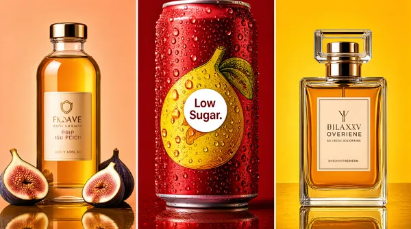
Landscape 16:9 gig cover, high-saturation product triptych, glossy editorial lighting. No watermark, no personal names.
[Layout]
Three tall vertical panels, equal width, separated by thin white lines. Each panel is a different color field: warm peach, deep red, and golden yellow. The products are centered in each panel.
[Subject]
Left: a clear glass bottle with golden liquid and sliced figs on a reflective amber surface. Center: a close-up of a red beverage can covered in water droplets with a yellow fruit graphic. Right: a rectangular perfume bottle with amber liquid on a reflective gold surface.
[Headline]
No headline.
[Badges]
A small white circular badge on the center can reads "Low Sugar." Generic labels in stylized sans and serif appear on bottles; do not reproduce exact words.
[Mood]
Amber, red, and gold palette; luxurious, juicy, and bold, with strong thumbnail contrast.](https://files.posterlet.com/assets/generated/md/nkfv3i3q34qb.webp)
![[Format]
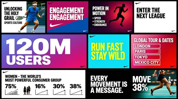
Landscape 16:9 gig cover, dense presentation-slide collage on a near-black field. Crisp editorial mockup finish, high contrast. No watermark, no personal names.
[Layout]
The frame is fully tiled by roughly ten landscape slide thumbnails butted edge to edge with very narrow near-black gutters, forming a four-column by three-row mosaic that bleeds off all four edges; the top and bottom bands are cropped mid-slide. The bands are unequal in height: a shallow top band about one fifth of the frame, a tall middle band about half the height holding the two widest hero tiles, and a medium bottom band. Every tile is a flat photomontage slide with tidy squared corners and a faint drop shadow, so the composition reads as a wall of screenshots rather than floating cards. No single tile dominates; the eye travels left to right along the middle band.
[Subject]
No cut-out person; the human presence is photographic content inside the tiles only. Athletes in motion appear full-bleed inside individual tiles and never break a tile boundary: a tennis player in a blue kit with a headband shot from a low angle, the legs of a sprinter on a teal court, and a silhouetted runner against a studio gradient. All figures are cropped hard by their own tile edges and lit with hard studio light.
[Headline]
Tile-level copy only, each tile carrying its own headline in a heavy grotesque, most of it cropped by the frame. Top band, left to right: a white tile with black uppercase 'UNLOCKING THE HOLY GRAIL' over a smaller sub-line; a magenta-and-blue tile with stacked white caps 'ENGAGEMENT ENGAGEMENT'; a red-violet sports tile with white caps 'POWER IN MOTION' over three small bullet rows; a white tile with black caps 'ENTER THE NEXT LEAGUE'. Middle band: a periwinkle-to-magenta gradient tile with an enormous white '120M' stacked over 'USERS'; a cyan tile with yellow condensed outline caps 'RUN FAST STAY WILD' on two lines; a pink-to-crimson tile headed 'GLOBAL TOUR & DATES' above rows of small white event boxes. Bottom band: a white stat tile headed 'WOMEN - THE WORLD'S MOST POWERFUL CONSUMER GROUP' above four figures, 75%, 16%, 30% and 38%, each with a tiny chart glyph; a black tile with white caps 'EVERY MOVEMENT IS A MESSAGE.'; and a photo tile with a cropped caps headline beside a small percentage label. Type is uniformly wide, tight, uppercase and flush to each tile's left edge.
[Badges]
Small Nike swooshes - flat asymmetric check marks - repeat in the corner of several tiles: white on the cyan 'RUN FAST STAY WILD' tile and on the black 'EVERY MOVEMENT IS A MESSAGE.' tile, dark on the white 'WOMEN' stat tile, and a yellow one low in the 'ENGAGEMENT' tile.
[Mood]
Charcoal black canvas with saturated magenta, cyan, periwinkle and lime accents over bright white slide grounds. Loud, kinetic, sportswear-campaign energy; at thumbnail size it reads as a busy quilt of very legible mini-posters.](https://files.posterlet.com/assets/generated/md/2nf851d16vdf.webp)
![[Format]
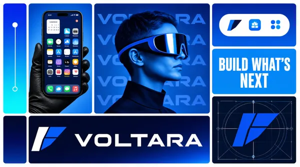
Landscape 16:9 gig cover, bento-grid tech-brand board in electric blue tones. Glossy device-render finish with duotone photography. No watermark, no personal names.
[Layout]
A bento collage on a white ground with even gutters. Far left: a skinny vertical gradient tile with three thin slider dots connected by a line. Left-centre, tall: a photo tile of a hand in a black glove holding a large smartphone upright, its home screen full of colourful generic app icons and a calendar widget. Centre, tall: a blue duotone photo of a person in profile wearing a chunky AR visor, ghosted repeated wordmark text behind the head. Right column: a gradient tile with a white dock of three rounded generic OS icons — a smiling-face finder-style icon, the brand app icon, and an app-store-style icon; below it a bright blue tile with bold white caps slogan text; below that the bottom-right tile, a dark navy construction-grid panel with the geometric mark built from blue blocks and thin guide circles. Bottom-left, the widest tile: a deep navy gradient panel with the white angular flag-like mark beside a large white extended caps wordmark.
[Subject]
The centre tile holds a generic person in profile with short hair wearing a reflective AR headset, blue duotone lighting, head-and-shoulders crop.
[Headline]
Wordmark: extended geometric caps in white on the navy hero tile (placeholder copy). Slogan tile: bold white caps reading a two-word-plus-suffix phrase (generic copy). No other copy.
[Badges]
The angular folded-flag mark recurs in the app dock, construction grid and hero lockup.
[Mood]
Electric blue, deep navy and cyan gradients; futuristic, product-launch energy. The glowing blue tiles and white wordmark read clearly at thumbnail size.](https://files.posterlet.com/assets/generated/md/a3jjgvxwx3lc.webp)
![[Format]
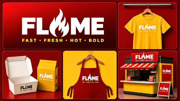
Landscape 16:9 gig cover, five-tile bento board of restaurant-brand mockups on a deep red ground. Clean 3D-render mockup finish. No watermark, no personal names.
[Layout]
Deep crimson backdrop with rounded tiles and thin gaps. Top-left, the largest tile: a red gradient panel with the primary wordmark centred — heavy white caps whose middle letter is replaced by a stylised flame built from the flanking strokes — over a small letter-spaced yellow caps tagline. Top-right: a red tile with a yellow crew-neck t-shirt on a wooden hanger from a ceiling rail, the lockup printed small on the chest. Bottom row of three tiles: a red tile with an open white takeout box and a yellow noodle box, both printed with the lockup; a yellow tile with a red apron on a wooden hanger, lockup centred on the bib; a red tile with a small street food kiosk — yellow body, red awning and roof sign carrying the lockup, menu poster and an A-frame board in front.
[Subject]
None — garments, packaging and a kiosk only.
[Headline]
Wordmark: heavy sans caps in white with the middle letter swapped for a flame glyph (placeholder copy); beneath it a small letter-spaced caps tagline of four generic words in yellow. The lockup plus tagline repeat small on every mockup.
[Badges]
None.
[Mood]
Crimson red and marigold yellow with white type; hot, appetising fast-casual energy. The giant flame wordmark on red reads instantly at thumbnail size.](https://files.posterlet.com/assets/generated/md/62yzq6jgl7mw.webp)
![[Format]
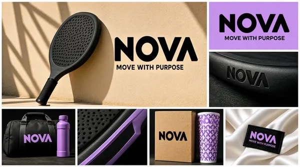
Landscape 16:9 gig cover, sporty brand-identity mosaic of seven photographic and flat tiles. Sunlit editorial-photography finish with hard shadows. No watermark, no personal names.
[Layout]
An irregular mosaic with white gutters. Top-left, the largest tile: a black paddle racket leaning on a sand-coloured court wall with lattice shadows, a big black chunky wordmark with a rounded letter and tagline set to its right on the wall. Top-right: a lilac flat tile with the same black wordmark centred and a small sans tagline beneath. Middle-right, below it: a dark close-up of the racket edge with the wordmark debossed small. Bottom row of four equal tiles: a black duffel bag and purple bottle on dark ground with a lilac wordmark; a macro of the racket frame in black and lilac; a kraft product box standing beside a lilac patterned sleeve, wordmark printed on the box; a close-up of a white satin garment with a black woven label carrying the lilac wordmark and tagline.
[Subject]
None — product mockups only.
[Headline]
Placeholder wordmark: four ultra-bold geometric caps with one rounded counter, black or lilac depending on the tile (placeholder copy); beneath it a small sans tagline of four generic words repeated across tiles.
[Badges]
None.
[Mood]
Sand beige, lilac purple and black; athletic, fresh, contemporary. Sunny shadows give energy; the repeated chunky wordmark ties the grid together at thumbnail size.](https://files.posterlet.com/assets/generated/md/85kxh3uml3nz.webp)
![[Format]
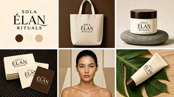
Landscape 16:9 gig cover, photorealistic branding-moodboard collage of six product mockups. Premium studio-photography finish, soft directional light, shallow depth of field. No watermark, no personal names.
[Layout]
A strict 3x2 grid of six equal rectangular cells separated by thin white gutters about 2 percent of the frame width. Reading order: cell 1 top-left, a flat cream panel carrying an elegant serif brand lockup centred, with three small colour-swatch pills in brown, cream and sand beneath it; cell 2 top-centre, a natural canvas tote bag hanging on a deep chocolate-brown wall with the lockup printed small on the bag front; cell 3 top-right, a white cosmetic jar with a dark-brown lid standing on a smooth grey river stone, lockup on the jar face; cell 4 bottom-left, a stack of cream business cards with two loose cards fanned in front on a dark ribbed surface, one loose card in dark brown; cell 5 bottom-centre, a beauty portrait panel of a woman against beige geometric wall panels; cell 6 bottom-right, a cream cosmetic tube lying diagonally across large green leaves on pale wood.
[Subject]
Cell 5 holds a young woman with wet-look slicked-back hair, bare shoulders, calm expression, looking straight at camera, head-and-shoulders crop, soft warm light; generic face, no identity. No other human subjects.
[Headline]
The lockup repeats on every mockup and is placeholder copy: a small letter-spaced serif all-caps word on the top line, a large high-contrast fashion-serif word with a long swash ligature in the middle line, and a small letter-spaced caps word beneath, all in chocolate brown on cream.
[Badges]
None.
[Mood]
Warm organic palette of cream, latte beige, chocolate brown with deep-leaf-green accents. Calm, spa-premium, feminine energy; at thumbnail size the six-cell rhythm and the brown-on-cream lockups read instantly.](https://files.posterlet.com/assets/generated/md/ck5x5gat02gn.webp)
![[Format]
Professional Fiverr gig cover, landscape 16:9 banner, warm scientific-product showcase style on a saturated orange ground with laboratory props. No watermark, no personal names.
[Layout]
A bright orange background with faint circuit-board line patterns and glowing dots. Three large tilted website screenshot panels stand across the upper two-thirds — green-white on the left, dark teal in the centre, natural green-white on the right — with a bold title slab across the centre and a photorealistic row of chemistry props along the bottom edge.
[Subject]
No people. In the foreground: an Erlenmeyer flask filled with amber liquid, a petri dish of fine white powder, a shallow dish of bright orange powder, two amber pill bottles labelled "NAD+ BOOSTER" and "BPC-157", a glass syringe with a metal needle, scattered white capsules, and a gold ball-and-stick molecular model.
[Headline]
Centre, overlapping all three screenshots: a rounded slab with a glossy orange-to-brown gradient carrying "PEPTIDE WEBSITE" in enormous heavy white caps.
[Devices]
Left screenshot: a green-and-white research site branded "VitaNova" with a "RESEARCH PEPTIDES" eyebrow, the headline "ADVANCING LIFE SCIENCE", a product card "VN-204" at "$34.99" beside a green-capped vial with molecule graphics, the block "WHY CHOOSE US" with "SCIENCE YOU CAN TRUST", badges "LAB VERIFIED" and "HIGH POTENCY", a "BROWSE BY CATEGORY" strip (Peptides, Salves, Amino Acids, Research Chemicals, Supplies) and a "BEST SELLING PEPTIDES" row. Centre screenshot: a dark teal site branded "BioCore Labs" dominated by a giant metallic "TB=500" over a vial, the line "Engineered for Recovery, Built for Tomorrow.", chips reading "Discreet Delivery", "100% Purity Guarantee" and "Lab Verified", a "Shop By Product" button and product cards labelled "TB-500", "CJC-1295", "BPC-157" and "Semorelin". Right screenshot: a natural-supplements site branded "VitaNatura" with the headline "Nourish Naturally. Live Vibrantly.", photographs of amber supplement bottles labelled "Daily Balance" and "Energy Boost" on stone, the strip "Nature-Driven • Clinically Backed • Sustainable Choice • Customer Focused", a "Wellness For Every Lifestyle" panel and a "pH Balance" card.
[Mood]
Scientific, product-rich and conversion-ready; hot orange ground, three clean storefront screens and a photoreal chemistry still-life grounding the composition.](https://files.posterlet.com/assets/generated/md/jq9fjic51nk9.webp)
![[Format]
Professional Fiverr gig cover, landscape 16:9 banner. Scientific luxury e-commerce showcase style with a soft blue molecular background and stacked store previews. No watermark, no personal names.
[Layout]
A light blue gradient background with soft hexagonal molecular motifs and blurred cream bokeh orbs floating in the depth. A dark blue rectangular banner spans the top. Below it, a green rounded bar holds five circular platform logos. The lower two-thirds are filled with three side-by-side website screenshot cards.
[Subject]
No people. The composition is a product-led collage of peptide e-commerce storefront previews.
[Headline]
Top banner: "LUXURY" in very heavy yellow sans-serif caps, then "PEPTIDE WEBSITE" in very heavy white sans-serif caps, all set on a dark blue rectangular slab.
[Badges]
Below the headline, a green rounded bar with a thin purple outline holding five circular brand marks side by side: the WordPress circular logo, the Elementor "E" mark, the WooCommerce circular mark, a green circular mark with a white stylised "Y", and the Shopify shopping-bag logo.
[Devices]
Three rectangular website screenshot cards below the badge row. Left card: a dark luxury peptide site branded "HEALTHY PEPTIDE" with two black-and-gold vials, the headline "PEPTIDES THAT PERFORM. RESULTS THAT LAST.", and a product grid labelled "OUR PREMIUM PEPTIDES". Centre card: a clean white-and-purple research site with three peptide vials, the headline "NEXT LEVEL RESEARCH. PURE PEPTIDES. PROVEN POTENTIAL.", and category icons for recovery, muscle strength, anti-aging and weight management. Right card: a green-accented medical site with a large peptide vial, the headline "SCIENCE DRIVEN. RESULTS PROVEN.", and a product carousel labelled "EXPLORE OUR TOP PEPTIDES".
[Mood]
Clinical, premium and product-focused; soft blue molecular background with gold-and-white type, platform badge row and polished peptide store previews.](https://files.posterlet.com/assets/generated/md/d20zzicl8s09.webp)