








About this collection
Every Fiverr gig lives or dies by a single image. Each cover here respects the real constraints of a gig image - one banner-shaped canvas, high-contrast text, and no clutter that would collapse at small sizes.
These are starting points, not finished listings. Every cover here is built around one idea: a single service promise, set in type large enough to survive being shrunk into Fiverr's search grid. The collection spans roughly thirty service areas — software and app development, design and branding, writing and translation, marketing, audio, data, and business consulting — so you can usually find a layout close to what you sell and adapt it.
Nothing here is a layered design file. Each one is a flat generated image, which is exactly what makes it quick: pick a layout, swap the headline, palette, and icons for your own service, and you have a listing image in a few minutes rather than an afternoon.
What a gig cover actually has to do
A buyer scanning search results sees your cover as a thumbnail no wider than a postage stamp, sitting next to a dozen competitors. That single constraint decides almost everything else:
- One promise, not a service list. "I will fix your WordPress site in 24 hours" reads at thumbnail size. "WordPress | SEO | Speed | Security | Maintenance" turns to mush.
- High contrast between text and background. Thin light type on a pale panel is the first thing to disappear when the image shrinks.
- Three to six words in the headline. Long headlines force small type, and small type is what becomes unreadable first.
- The service visible before reading a word. A layout cue — a device frame, a waveform, a chart, a colour swatch — tells the buyer the category instantly.
Resizing and export
Fiverr publishes its own requirements in the uploader, and they change - check them there rather than trusting a number quoted in a blog post. What does not change is the direction of the resize: always scale down from the download. Never upscale a smaller image to reach the uploader's width, because the text edges go soft, and soft type is exactly what a thumbnail cannot afford.
When you trim to match the uploader's proportions, do it symmetrically and keep the headline centred, so the crop does not eat one side of the promise.
Three things worth doing before you upload
- Judge the thumbnail, not the full-size file. Shrink the preview down to search-result size, or just squint. If the promise still reads, the cover works. 2. Keep a colour system across your gigs. Buyers skim a grid of near-identical covers; a consistent accent colour makes your listings recognisable among strangers. 3. Leave the outer margin clear. Gig images get cropped slightly differently across placements, so keep text away from the outer edge of the canvas.
Common questions
Will the downloaded cover meet Fiverr's upload requirements?
Check the uploader: Fiverr shows its current accepted format, file limit and recommended image spec there, and those are the platform's requirements, not ours. What matters on this side is direction — start from the downloaded cover and scale down to fit, never up from a smaller file.
Will the text still be readable in the search grid?
Shrink it to search-result size before uploading. That is close to what buyers actually see when comparing gigs, and it is where most covers fail — usually because the headline was set too small or the contrast was too low to begin with.
How many images should one gig have?
Fiverr's gallery takes up to three images and two videos. Lead with the strongest cover, then spend the remaining slots on a work sample, a before-and-after, or a deliverable preview rather than more headline art.
Can I use the same cover on several gigs?
No. Buyers often see two or three of your gigs together, and identical covers make them look like one listing repeated. Change the headline, the accent colour, and the main visual so each gig reads as its own service.
Can I change the text or colours after generating?
Not in place. The wording is baked into the image, so there is no text layer to retype. Download it and edit it in your own tool, or use the "Use as Template" option to regenerate it with different copy.
Why do the covers in this collection look so different from each other?
Because the range is deliberately broad. Each cover was written around the specific service it advertises, so a logo animation cover and a translation cover share a job — selling one service at thumbnail size — but not a visual style. That variety is what lets you give every gig a distinct look.
![[Format]
Landscape 16:9 gig cover, full-bleed documentary photograph with a type overlay. Warm, cinematic, shallow-depth finish. No watermark, no personal names.
[Layout]
A single photograph fills the frame entirely: a man standing at a city rooftop edge at golden hour, shot from the front-left so he occupies the right ~55% while the blurred skyline and a glass balustrade fill the left and the background. A soft dark gradient washes the left third of the image so the white type stays legible, and a light grey horizontal rail line runs across the frame behind him. The type stacks on the left in a single centred column, and a full-width red band cuts across the very bottom of the frame. There are no borders, panels or card shapes — the photograph is the whole background.
[Subject]
A young man with long dreadlocks gathered into a top knot, a white earbud in one ear, wearing an olive-green jacket worn open over a plain white tee. Standing, crop from mid-thigh upward, body angled toward the left, head lowered reading an open rust-orange notebook held in both hands with a pen poised. Warm backlit sunset light from behind, softly blurring the city beyond him.
[Headline]
Top-left, a short line of small white letterspaced uppercase — a personal first name rendered as a neutral placeholder of the same length. Then, centred over the left half, four stacked lines of heavy white uppercase sans-serif, each narrower than the one above: "WEBSITE COPY", "AND", "BLOG POST", "IN". Beneath them, a bright green rounded plate holds "FRENCH" in heavy white uppercase. Across the bottom red band, white bold italic uppercase reads "CHECK OUT MY GIG NOW !".
[Badges]
None.
[Mood]
Warm, cinematic and personal. Palette: golden sunset tones, olive green, rust orange, white and green, plus one red band. At thumbnail size the white stacked headline on the darkened left reads clearly over the photograph, and the red bottom band works as a bold call to action.](https://files.posterlet.com/assets/generated/md/10sfu6yrxvsi.webp)
![[Format]
Landscape 16:9 gig cover, bright office-photo composite. Clean, airy, high-key corporate finish with soft shadows. No watermark, no personal names.
[Layout]
A near-white studio wall fills almost the whole frame, with an implied white desk surface running along the bottom edge so the scene is entirely high-key. The upper-left and mid-left carry a left-aligned text block. The right third holds a seated man behind the desk. A silver laptop sits open on the desk in the bottom-centre-left, its lid angled away from camera and clipped by the frame edge. In the bottom-right foreground a blank clipboard with a black pen lies flat, angled toward the viewer and closer to camera than the man, creating three simple depth planes: clipboard, desk edge, then man and wall. The type and the figure never overlap.
[Subject]
A man in his late twenties, short dark hair, light stubble, crisp white dress shirt and a blue-and-black diagonally striped tie. Seated at the desk, torso turned toward the laptop, head lowered and smiling down at the screen, one hand resting near the keyboard. Crop from mid-thigh upward on the right side, lit by a large soft window-style key from the left so the white shirt separates gently from the white wall.
[Headline]
Across the top, spanning most of the frame width as the largest element: "WEBSITE CONTENT" in a tall condensed heavy black grotesque, uppercase, on a single line. Beneath and left-aligned, five stacked short lines in a lighter condensed grotesque coloured mid-green, each prefixed by a hyphen: "- SEO FRIENDLY", "- UNIQUE & ENGAGING", "- QUICK TURNAROUND", "- 100% CUSTOMER SATISFACTION", "- HUMAN WRITTEN AND SEARCH-ENGINE FRIENDLY" (neutral placeholder copy in place of any engine name).
[Badges]
None.
[Mood]
Neutral, trustworthy and lightly corporate. Palette: white, warm grey, black and a green accent for the list, with a blue/teal pop from the tie. At thumbnail size the black top headline and the green list read cleanly against the white, while the man acts as a calm secondary focal point.](https://files.posterlet.com/assets/generated/md/dtj9581p8aiv.webp)
![[Format]
Landscape 16:9 gig cover, torn-paper collage typographic composite. Dark urban texture with hand-drawn accents. No watermark, no personal names.
[Layout]
A near-black background is textured like a photographed brick wall, with the mortar lines catching a little light. Three torn-paper rectangles are pasted across it in a diagonal cascade: the first at the upper-left, the second slightly lower and shunted right so it overlaps the first's lower-right corner, and the third at the lower-right overlapping the second. All three are rotated a couple of degrees off axis and have ragged fibrous torn edges with a thin coloured under-tissue visible along the tears. Small purple chalk dashes sit at the mid-left, a big white hand-drawn arrow curves down the right side, and a two-stroke cyan chalk underline is drawn at the lower-left. There is no subject and no photographic element anywhere in the frame.
[Subject]
None — typographic only.
[Headline]
Hand-lettered chalk-style lettering, one word per torn paper: "SEO" in white on the first pink-magenta paper, uppercase, with a rough chalky edge; "OPTIMIZED" in solid black on the second cyan paper, uppercase, the widest and longest word of the three; "ARTICLE" in white on the third pink-magenta paper, uppercase, smaller than the other two. At the lower-left, in a smaller white chalk hand, "Order Now" sits with two short cyan underline strokes drawn beneath it.
[Badges]
None; the only graphic devices are the purple chalk dashes at the mid-left, the white hand-drawn arrow at the right and the cyan chalk underline at the lower-left.
[Mood]
Raw, street-poster and handmade. Palette: black brick, hot pink-magenta, cyan and white with a purple accent. At thumbnail size the three bright torn papers read as a stacked three-word headline standing out sharply against the dark wall.](https://files.posterlet.com/assets/generated/md/xtk2iwloyc3t.webp)
![[Format]
Landscape 16:9 gig cover, comic-illustration composite over a dark angled panel. High-contrast graphic-novel finish. No watermark, no personal names.
[Layout]
A deep navy-teal ground fills the frame, cut by a large darker angled panel running from the upper-right downward, with a very faint grid and keyboard-like pattern visible inside it. Two thin mustard-yellow bands clip the frame edges, one across the very top and one across the very bottom. The left ~40% is filled by an illustrated woman from the thigh up, drawn in vector comic style with black outlines, extending off the bottom edge. The right ~60% stacks, right-aligned: the headline block, then a five-line bulleted list, then a red button. A small white plate sits alone at the top-left corner.
[Subject]
A stylised vector comic illustration rather than a photograph: a woman with long wavy brown hair, large dark round sunglasses, bright red lips, pink nails, one hand raised to cover her mouth in a playful gesture, wearing a white off-shoulder top. Crop at the thigh, body angled slightly toward the right, face turned toward the viewer. Flat cel shading with bold black contour lines.
[Headline]
Right side, right-aligned: "SEO Articles" in bold white with the word "Articles" picked out in yellow; then "& Blog Post" in bold white; then "Writing" in very heavy yellow, by far the largest word in the frame, with a thin white underline rule beneath it. Below, five left-aligned bullet lines in bold white with round yellow bullets: "Keyword Rich Content", "SEO Optimized", "Plagiarism-Check Pass" (neutral placeholder in place of a third-party tool name), "Well Researched", "Competitors Analysis". At the bottom of the column a red rounded pill reads "ORDER NOW" in white bold uppercase.
[Badges]
At the top-left, a small white plate holds a black-outlined rounded rectangle containing a short account handle line — render it as a neutral placeholder handle, not a real account. No other marks.
[Mood]
Punchy, graphic and attention-grabbing. Palette: deep navy-teal, mustard yellow, white and red. At thumbnail size the huge yellow "Writing" and the illustrated face dominate the left and right of the frame, with the red button supplying the order cue.](https://files.posterlet.com/assets/generated/md/546acpqeg0rp.webp)
![[Format]
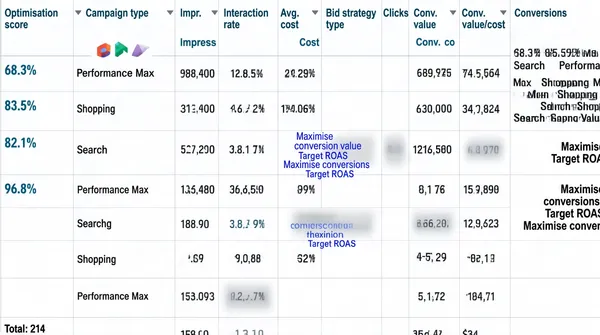
Landscape 16:9 gig cover that is a full-bleed screenshot of a Google Ads campaign performance report table. Flat digital screenshot finish, no art direction and no photography. No watermark, no personal names.
[Layout]
The entire frame is one wide table viewed straight on, with no background, border, drop shadow or surrounding design of any kind. A single header row runs across the top, below which nine body rows of equal height are separated by thin light-grey horizontal rules. Thirteen columns are divided by faint vertical rules, most of them narrow, with the widest column sitting in the middle and the widest text column at the far right. A total row is clipped by the bottom edge so only a stub of a label and a number remain visible. Several individual cells are covered by soft grey blur patches, and tiny coloured glyphs appear in the leftmost column on a few rows.
[Subject]
None — a data-table screenshot only, with no people in the frame.
[Headline]
Header row, left to right, in small teal-blue medium weight with a tiny sort triangle beside a few of them: "Optimisation score", "Campaign type", "Impr.", "Interact.", "Interaction rate", "Avg. cost", "Cost", "Bid strategy type", "Clicks", "Conv. rate", "Conv. value", "Conv. value/cost", "Conversions". In the body rows: the leftmost column holds small teal percentage scores (approximately 68.3%, 83.5%, 82.1%, an empty cell, then 96.8%, followed by several blanks), with a tiny coloured icon beside the first three; the second column holds short campaign names such as "Performance Max", "Shopping" and "Search" stacked one per row; the numeric columns hold thousands-separated impression counts, two-decimal interaction percentages, costs prefixed by a short currency code, small click counts and conversion percentages, all right-aligned into a jagged column grid. The bid-strategy column holds short multi-line phrases in blue-violet text such as "Maximise conversion value" and "Target ROAS".
[Badges]
The only marks are three tiny Google Ads campaign-type icons in the leftmost body column (Performance Max, Shopping and Search badges) plus a few small grey sort triangles in the header row.
[Mood]
Utilitarian, dry and evidence-first. Palette: white, light grey rules, small teal-blue header text, blue-violet bid-strategy text and the soft grey blur patches. At thumbnail size it reads as a dense spreadsheet rather than a designed cover, so the numbers themselves are the whole message.](https://files.posterlet.com/assets/generated/md/n8nvzd5vfpkv.webp)
![[Format]
Landscape 16:9 gig cover, layered yellow-and-white marketing composite with a circular photographic portrait. Bright, busy, high-energy finish with painted brush textures. No watermark, no personal names.
[Layout]
A saturated yellow ground carries broad white paint-brush sweeps through the top-right and bottom-right corners and a torn black brush stroke across the middle-left. The left ~55% stacks, top to bottom: a small white pill at the top-left, a three-line headline, one short slogan line, and a wide white rounded panel holding a four-column icon row divided by thin vertical rules. The right ~45% is dominated by a large white circle ringed by a thick yellow band that holds a photographic portrait and overlaps the yellow ground; a purple rosette seal sits at the circle's lower-right edge. A line-drawn head with a scribbled brain-and-heart floats above the portrait near the top-centre. A full-width black bar runs along the very bottom, divided into four white items.
[Subject]
A man in his thirties, dark hair, short beard, wearing a black suit jacket over a white shirt with a dark tie. Head-and-shoulders inside the circular portrait crop, shoulders square, broad open smile at camera. Even studio light with a softly blurred office background behind him inside the circle.
[Headline]
Top-left, a small white rounded pill holds a tiny dark brain-and-heart icon beside "PROFESSIONAL & RELIABLE" in bold dark-navy uppercase. Beneath, three stacked lines of very heavy uppercase filling the left column: "MENTAL" in black, "HEALTH" in vivid purple, and "ARTICLES" in white sitting on the torn black brush stroke so it reads as a white-on-black bar. Under them, one line of dark sentence-case type: "Words that heal. Insights that inspire." The four-column white panel then reads "1. SEO optimised", "2. 100% HUMAN WRITTEN", "3. ON-TIME DELIVERY", "4. WELL RESEARCHED". Along the bottom black bar, four white items separated by thin vertical rules: "E-BOOK WRITER", "MENTAL HEALTH ARTICLES", "MENTAL HEALTH BLOG POSTS", "WHITE PAPERS".
[Badges]
A purple rosette seal at the lower-right of the portrait holding a small heart-in-hands icon with "QUALITY GUARANTEED" arced around it; a small line-drawn head with a scribbled brain-heart and radiating strokes near the top-centre.
[Mood]
Sunny, busy and reassuring. Palette: bright yellow, white, black and vivid purple. At thumbnail size the three-line headline and the circled smiling face read immediately.](https://files.posterlet.com/assets/generated/md/sp9oxewfud5y.webp)
![[Format]
Landscape 16:9 gig cover, flat vector-and-photo composite with a full-width bottom banner. Clean modern corporate finish. No watermark, no personal names.
[Layout]
A flat royal-blue field fills the frame and is decorated with thin white outline shapes: a large concentric ring drawn like a target at the top-centre, a partial arc at the lower-right, and a few outlined squares. A short row of four small gold dots sits at the upper-left, followed by a row of gold chevron arrows pointing right across the middle-left, with a small dotted pattern near the bottom-left corner. The left ~40% carries a three-line stacked headline, left-aligned and vertically centred. The right ~55% holds a photographic cut-out of a man from the waist up, extending off the bottom and right edges. A full-width mustard-yellow band runs across the bottom fifth of the frame and covers the man's lower torso.
[Subject]
A man in his forties, receding dark hair, short beard and moustache, dark-framed rectangular glasses, a dark navy overshirt worn open over a plain grey tee. Waist-up, body angled slightly toward the left, face to camera with a friendly closed-mouth smile. Even soft lighting with a gentle separation from the blue ground.
[Headline]
Centre-left, stacked left-aligned: "SEO", then "WEBSITE", then "CONTENT" in a very tall heavy condensed white uppercase grotesque, three lines each roughly a fifth of frame height. Across the bottom band, centred in black bold sentence-case sans-serif on two lines: "Attract more leads, inform your target audience, & boost your online presence with optimized landing pages!".
[Badges]
Small decorative vector accents only — a large thin white target ring at the top-centre, a row of four gold dots and a row of gold chevrons at the left, thin white outlined squares at the right, and a small dot pattern at the lower-left.
[Mood]
Blue-chip, professional and steady. Palette: royal blue, mustard yellow, white, black and a touch of gold. At thumbnail size the white condensed headline stack reads instantly on the blue, and the wide yellow copy band along the bottom works like a strap-line that finishes the offer.](https://files.posterlet.com/assets/generated/md/ustalthwiklp.webp)
![[Format]
Landscape 16:9 gig cover, sunburst poster composite with a framed portrait. Bright, high-energy finish. No watermark, no personal names.
[Layout]
A vivid yellow ground is filled with a sunburst of lighter yellow rays radiating from the centre, overlaid with a faint technical pattern of thin circuit-like lines and barely visible map-and-cloud motifs. The left ~40% is dominated by a large diamond (rhombus) frame outlined in black, with a second thin inner line just inside it, rotated so its points face up, down, left and right; the portrait sits inside the diamond and is clipped by its edges. The right ~55% stacks an assembly right-aligned: a red headline word, then two stacked rounded plates, then a bottom row carrying the Google Analytics logo and the Semrush logo side by side.
[Subject]
A woman in her early thirties, very long straight dark hair, a red-and-white patterned top, bold red lipstick, small dark drop earrings. Head-and-shoulders inside the diamond crop, shoulders square, head straight to camera with a confident slight smile. Even studio lighting against a plain pale backdrop within the diamond.
[Headline]
Right side, top to bottom: "SEO" in heavy red uppercase; then a yellow rounded rectangle holding "WEBSITE" in very heavy black uppercase; then a second, separate yellow rounded rectangle holding "CONTENT" in the same heavy black uppercase, offset slightly to the right of the plate above so the two plates visibly stagger.
[Badges]
Two brand logo lockups along the lower edge, side by side: on the left, the Google Analytics logo — three ascending orange bars beside the two-line grey wordmark "Google Analytics"; on the right, on a white plate, the Semrush logo — an orange circular flame-like mark beside the black uppercase wordmark "SEMRUSH".
[Mood]
Loud, sunny and commercial. Palette: bright yellow, red, black and white with orange accents. At thumbnail size the diamond-framed portrait and the staggered red-and-black plates dominate the frame, while the sunburst rays keep the energy high.](https://files.posterlet.com/assets/generated/md/87yglwh666kq.webp)
![[Format]
Landscape 16:9 gig cover, layered badge composite. Saturated, glossy promotional finish. No watermark, no personal names.
[Layout]
A deep forest-green ground fills the frame, crossed by a fine white circle outline drawn large across the upper-centre, a cyan-to-blue curved band sweeping through the bottom-right corner, a dashed light arc near the left of the subject and a small dotted white block in the lower-left corner. The left ~35% holds a photographic cut-out of a woman from the waist up, extending off the bottom edge and cut clean against the green. The right ~60% carries a stacked assembly, vertically centred: squiggle doodles above, a three-line gold headline, a dark rounded banner beneath it, and a red button at the bottom.
[Subject]
A woman wearing a light lilac hijab draped over the shoulders and a white shirt with the sleeves pushed up, a black belt visible at the waist. Crop at the hip, arms folded across the chest, body angled slightly toward the right while the face turns to camera with a warm open smile showing teeth. Even studio lighting with a soft glow behind her.
[Headline]
Right side, stacked: "SEO / ARTICLE / WRITING" on three left-aligned lines of very heavy italic-leaning gold uppercase with a dark olive outline and a hard offset shadow, each line roughly a fifth of frame height. Beneath them, a dark-green rounded banner holds "ORIGINAL, HUMAN-WRITTEN ARTICLES" in white bold uppercase across two centred lines. At the bottom, a glossy red 3D extruded rounded button reads "ORDER NOW" in white bold uppercase.
[Badges]
Decorative doodles only — a white squiggle line above the headline, small yellow tick-and-ray marks either side of the banner, a dashed white arc near the lower-left of the subject, and a small dotted white block in the lower-left corner. No business logos.
[Mood]
Confident, polished and promotional. Palette: deep forest green, gold, white and red, with lilac from the hijab. At thumbnail size the gold italic headline on green reads as premium, and the red ORDER NOW button delivers the final punch.](https://files.posterlet.com/assets/generated/md/ztnolgfmpttw.webp)
![[Format]
Landscape 16:9 gig cover, casual personal photograph with a sticker-style text overlay. Warm, natural snapshot finish. No watermark, no personal names.
[Layout]
A single warm-toned photograph fills the frame edge to edge: a young woman standing indoors in front of a wooden interior with plants, glassware and panelling, shot at close range from the chest up. She is positioned right of centre, so her head fills the upper-right and her body the lower-right. A bold outlined word stack lies over the lower-left of the photo, taking roughly the left third and sitting over the darkest, lowest-detail part of the image so it stays legible. Shallow depth of field makes the wooden background fall soft.
[Subject]
A young woman in her early twenties, very long straight platinum-blonde hair with darker roots, a dark oversized hooded sweatshirt, small silver hoop earrings. Head-and-shoulders, body angled slightly left, one hand raised to tuck her hair back behind her ear, relaxed closed-mouth smile at camera. Available natural light with a warm, slightly golden cast.
[Headline]
A two-line stack over the lower-left, rotated a few degrees counter-clockwise, set in a hand-drawn rounded bubble font: "YOUR" on the top line and "WRITER" beneath it, slightly larger. Both words are white lettering with a thick red outline and a thin white outer stroke plus a soft dark drop shadow, so they pop off the dark background.
[Badges]
None.
[Mood]
Warm, informal and personal. Palette: warm wood browns, dark navy hoodie, blonde hair, with the red-and-white sticker lettering as the only graphic accent. At thumbnail size the red-outlined YOUR WRITER reads instantly against the dark left side, and the face carries the gig's personality.](https://files.posterlet.com/assets/generated/md/eeggf3p9kqkr.webp)
![[Format]
Landscape 16:9 gig cover, split photographic-and-panel composite. Dark, cool, slightly moody finish. No watermark, no personal names.
[Layout]
The frame is split on a steep diagonal. The left ~45% is a close-up photograph of an open Apple MacBook Air shot from above at a strong angle: a silver aluminium keyboard deck with black keycaps in the Apple layout in the lower-left foreground, its "MacBook Air" bezel text visible, and a dark screen lid receding at the top-left, both resting on a warm wooden desk surface, with shallow depth of field. The right ~55% is a near-black translucent panel laid over a blurred, faintly visible repetition of the same keyboard, tilted to follow the diagonal. All the type sits on that dark panel, left-aligned. A small 3x3 grid of white dots sits in the top-right corner, and a few thin white outlined squares and diamonds are scattered near the lower edges of the panel.
[Subject]
None — this is a laptop and keyboard product photograph only, with no people in the frame.
[Headline]
On the dark right panel, left-aligned: "SEO OPTIMIZED" in white uppercase sans-serif, then "BLOG/ARTICLES" directly beneath in the same heavy white uppercase grotesque, the two lines forming the dominant block with each roughly a sixth of frame height. Below them, three short left-aligned lines in a lighter white regular sans-serif with even leading: "Unique content", "Errors free", "Well researched".
[Badges]
A small 3x3 grid of round white dots in the top-right corner, and a few thin white outlined square and diamond shapes scattered near the lower edges of the dark panel; the open laptop is an Apple MacBook Air, photographed deck-on so its lid carries no visible Apple logo.
[Mood]
Cool, technical and understated. Palette: black and dark grey with white type, plus warm wood and silver from the keyboard photograph. At thumbnail size the white two-line headline on the black panel dominates the right side, while the angled keyboard shot gives the cover a real working-desk texture.](https://files.posterlet.com/assets/generated/md/ngkuxp2ehc0o.webp)
![[Format]
Landscape 16:9 gig cover, purely typographic. Dark slate with hand-lettered script, chalk-powder texture and a faint metallic sheen. No watermark, no personal names.
[Layout]
A near-black charcoal ground fills the entire frame with a soft powdery texture, like a rubbed blackboard or dark slate. Nothing else appears in the frame: two large hand-lettered words are stacked in the centre, the upper word centred and slightly smaller, the lower word wider and centred beneath it, and together they occupy roughly two-thirds of the frame width and most of its height. The mass sits centred vertically, with generous dark margins on every side, and there is no border, rule, plate, icon or shape anywhere.
[Subject]
None — typographic only.
[Headline]
Two stacked centred lines of large decorative hand-lettered script, in pale blush-silver with a chalky, faintly glittered texture and a thin light outline so the strokes look dusted: "Creative" on the first line, and "Writing" on the second, with tall looping ascenders, an exaggerated curly "C", decorative curls on the top of the cap letter and on the descender of the "g". Letterspacing is loose and irregular, as though drawn by hand, and the lower word is noticeably wider than the upper one.
[Badges]
None.
[Mood]
Quiet, artisanal and moody. Palette: near-black charcoal with one pale pink-silver chalk script. At thumbnail size the two glowing hand-lettered words are the only content in the frame, so the cover reads as a pure craft/creative-writing statement with no face, no offer and no badges.](https://files.posterlet.com/assets/generated/md/aj425dclg503.webp)
![[Format]
Landscape 16:9 gig cover, minimal flat composite with a rectangular photo card. Clean, modern, restrained finish. No watermark, no personal names.
[Layout]
A single solid indigo-violet field fills the frame with no gradient and no texture. The left ~55% carries two stacked text elements, left-aligned and vertically centred: a single headline line, and below it a teal rounded pill holding two centred lines. The right ~40% holds a photographic cut-out of a woman rendered as a hard-edged upright rectangle with a soft drop shadow behind it, so she reads as a pasted photo card rather than a silhouette; the card runs off the bottom edge and close to the right edge. A wide margin of flat indigo separates the text column from the photo card, and nothing overlaps.
[Subject]
A woman in her forties, very full curly ginger-auburn hair falling to the chest, a dark green knitted cardigan over a deep purple top, small dark earrings. Head-and-torso inside the rectangular crop, shoulders square, gentle closed-mouth smile to camera with faint smile lines around the eyes. Soft even lighting against a pale grey-white backdrop inside her card.
[Headline]
One line, left-aligned, in a bold white geometric sans-serif occupying roughly 45% of the frame width: "Blog Posts Built to Rank". Beneath it, a wide teal rounded pill holds two centred lines: "Human-Written SEO" in white bold, and beneath it "For Real Businesses" in white italic.
[Badges]
None.
[Mood]
Calm, credible and personal. Palette: indigo-violet, teal green and white, with warm ginger and deep green coming from the subject. At thumbnail size the white headline and the teal pill read instantly against the flat indigo, while the rectangular photo card adds a human but neatly controlled presence.](https://files.posterlet.com/assets/generated/md/y6yibslvdri8.webp)
![[Format]
Landscape 16:9 gig cover, layered ribbon-and-plate composite. Saturated gradient poster finish. No watermark, no personal names.
[Layout]
A diagonal gradient ground runs from hot magenta at the lower-left through violet to olive-yellow at the upper-right, with a large soft yellow wedge entering from the bottom-right corner behind the subject. The left ~45% carries a stacked assembly: a rounded olive-yellow header plate at the top, then three coloured ribbon pills stacked down the column in a zigzag — the first and third ribbons extend to the left with a circular icon disc at their outer left end, while the middle ribbon extends to the right with its disc at its right end — and a white button plate at the very bottom. A thin dotted column of small dark dots runs down the far-left margin. The right ~50% holds a cut-out woman from the thigh up, extending off the bottom and right edges.
[Subject]
A woman in her late twenties, long straight brown hair, round wire-rimmed glasses, an olive-green button-up shirt. Standing, crop at the thigh, arms folded across the chest, shoulders square, head straight to camera with a bright open smile showing teeth. Even studio lighting with a soft edge separation from the gradient behind.
[Headline]
Top-left: a wide rounded olive-yellow plate holds "ARTICLE" in very heavy white uppercase, with "WRITING EXPERT" in smaller white bold caps beneath it, both left-aligned inside the plate. The three ribbon pills then read top to bottom: "QUALITY CONTENT" in white bold uppercase on an orange-to-pink gradient ribbon with its white disc at the left holding a black lightbulb-with-check icon; "SEO OPTIMIZED" in white bold uppercase on a teal-to-green gradient ribbon with its white disc at the right holding a black gear icon; "CREATIVITY & UNIQUENESS" in white bold uppercase on a pink-to-magenta ribbon with its white disc at the left holding a black compass icon. At the bottom, a white plate holds "ORDER NOW" in heavy black uppercase.
[Badges]
Three circular white icon discs built into the ribbon ends — a lightbulb with a check, a gear, and a compass. A thin vertical column of small dark dots runs down the far-left margin.
[Mood]
Bold, layered and faintly retro-poster. Palette: magenta, violet, olive-yellow, orange and teal, all highly saturated. At thumbnail size the olive ARTICLE plate and the three bright ribbons read like a checklist, with the smiling figure supplying warmth on the right.](https://files.posterlet.com/assets/generated/md/zp0eiwqb2s0d.webp)
![[Format]
Landscape 16:9 gig cover, diagonal split composite over a night-city backdrop. Bold, saturated poster finish. No watermark, no personal names.
[Layout]
The frame is split on a strong diagonal. The left ~45% is a flat mustard-yellow field; the right ~55% is a deep blue field that fades into a faintly visible night skyline of twin towers. A large dark-blue circular shape is implied where the two fields meet, traced by a soft curved white line, and a dashed white arc sits in the top-left corner of the yellow field while a dotted white spiral arrow curls in the lower-right of the blue field. The left side holds a photographic cut-out of a woman extending off the bottom edge, one open palm gesturing toward the text. The right side stacks headline, ribbon and button, right-aligned.
[Subject]
A woman in her late twenties, long straight blonde hair, a light blue crew-neck sweater, blue jeans. Standing, crop from mid-thigh upward, body turned three-quarters toward the right with one arm extended and the open palm angled up in a presenting gesture, the other hand resting at the hip, face to camera in a bright open smile. Even bright studio lighting with a faint glow behind her.
[Headline]
Right side, right-aligned: "SEO / ARTICLE / WRITING" on three stacked lines of very heavy uppercase sans-serif in white with a thick dark-blue outline and a hard offset shadow, each line roughly a quarter of the right field's height. Below the stack, an orange ribbon with notched flag-tailed ends carries "100% UNIQUE CONTENT" in bold black uppercase. Beneath the ribbon, a glossy red 3D extruded button reads "ORDER NOW" in white italic bold with a bright highlight along its top edge.
[Badges]
A dashed white arc at the top-left; a dotted white spiral arrow with two arrowheads in the lower-right; a faint photographic skyline of twin towers baked into the blue field.
[Mood]
Punchy, commercial and confident. Palette: mustard yellow, deep blue, orange, red and white. At thumbnail size the white outlined three-line stack on blue cuts through the yellow block, and the orange ribbon plus red button drive a clear path to the order.](https://files.posterlet.com/assets/generated/md/4ttynl7960n0.webp)
![[Format]
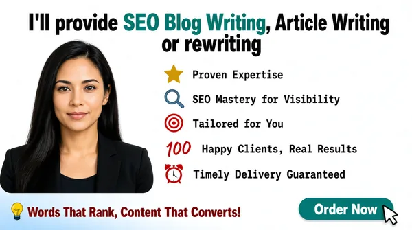
Landscape 16:9 gig cover, clean white editorial composite. Bright, minimal, infographic-style finish. No watermark, no personal names.
[Layout]
A near-white ground fills the frame. A two-line headline spans the top, centred, with the second line visibly shorter. Below it the frame splits into two columns: the left ~38% is a photographic portrait in a soft-cornered crop that bleeds off the left and bottom edges, and the right ~55% is a five-row icon list, left-aligned with a consistent icon column and generous vertical leading, running from just under the headline down to about three-quarters of the frame height. Along the bottom sits a single row: a left-aligned slogan and, at the far right, a rounded pill button. A faint pale-blue gradient band washes the bottom-left corner as a quiet footer.
[Subject]
A woman in her early thirties, very long straight dark hair, a black blazer over a dark top. Head-and-shoulders, centred inside the left crop, shoulders square, calm neutral gaze straight at camera with a faint closed-mouth smile. Soft even lighting with a pale off-white backdrop behind her.
[Headline]
Top, centred, on two lines in a heavy grotesque that mixes two colours inside one sentence: "I'll provide" in black, then "SEO Blog Writing, Article Writing" in teal green, then "or rewriting" back in black at the start of the second line. Beneath, five left-aligned list rows in a monospace-flavoured black regular type, each preceded by a small coloured pictogram: a gold star with "Proven Expertise"; a blue-grey magnifier with "SEO Mastery for Visibility"; a red-and-white concentric target with "Tailored for You"; a small red "100" mark with "Happy Clients, Real Results"; a small red alarm clock with "Timely Delivery Guaranteed". Along the bottom-left, a slogan in dark red bold reads "Words That Rank, Content That Converts!" followed by a small yellow lightbulb pictogram.
[Badges]
Five small multicoloured list pictograms — star, magnifier, target, "100" mark and alarm clock. At the bottom-right, a solid teal rounded pill reads "Order Now" with a small white cursor-click icon overlapping its right edge.
[Mood]
Clean, friendly and professional. Palette: white, teal green, dark red and black with small gold and blue accents. At thumbnail size the mixed-colour headline and the icon list read as a tidy, credible service summary.](https://files.posterlet.com/assets/generated/md/r4t4lh6r0i82.webp)
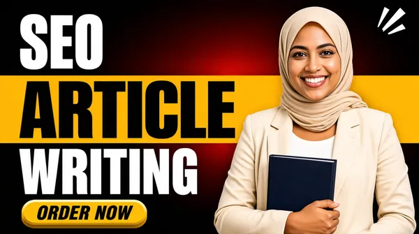
![[Format]
Landscape 16:9 gig cover, bold banded typographic composite with a photographic cut-out. High-contrast, saturated finish. No watermark, no personal names.
[Layout]
A dark ground gradients from near-black at the corners to a deep maroon-red glow across the centre, so the whole backdrop reads as softly lit. A wide mustard-yellow horizontal band cuts straight across the middle of the frame at full width, splitting the dark ground into an upper and a lower zone. The left ~55% carries the stacked headline: one line on the dark above the band, one on the band itself, one on the dark below, with a button beneath. The right ~45% holds a cut-out woman from the waist up who overlaps both the yellow band and the dark ground, extending off the bottom and right edges. Two small white comic accent strokes sit in the upper-right corner.
[Subject]
A woman wearing a beige hijab wrapped close to the head and a cream-beige blazer over a white top, holding a dark navy book against her body with one arm. Waist-up, body angled slightly toward the left, face to camera with a bright open smile showing teeth. Even studio lighting with a soft warm glow behind her.
[Headline]
Reading downward: "SEO" in heavy white uppercase on the dark ground; "ARTICLE" in heavy black uppercase sitting on the wide mustard-yellow band and filling it edge to edge in a thick condensed grotesque; "WRITING" in heavy white uppercase on the dark ground below. Beneath, a yellow 3D extruded pill with a bevel reads "ORDER NOW" in heavy black italic uppercase.
[Badges]
None — the only extra marks are the two small white comic accent strokes in the upper-right corner.
[Mood]
Bold, warm and confident. Palette: near-black, deep maroon-red, mustard yellow and white, with cream and beige coming from the subject. At thumbnail size the black ARTICLE on the full-width yellow band is the dominant read, and the smiling figure plus the yellow button complete the offer.](https://files.posterlet.com/assets/generated/md/brkspb7chseo.webp)
![[Format]
Landscape 16:9 gig cover, minimal centred portrait card. Soft, airy, near-white finish with very low contrast. No watermark, no personal names.
[Layout]
An almost-white frame with a faint pale-mint wash across it. The single structural element is a large circle sitting dead-centre horizontally and slightly above centre vertically, filling roughly 70% of the frame height, hard-edged with no ring, border or shadow. Directly beneath it a single line of text is centred in the lower third. Along the very bottom edge a wide faint sage-green wave band crosses the full width at very low contrast. Enormous whitespace surrounds everything, with no overlap and no other ornament in the frame.
[Subject]
A woman in her early thirties, shoulder-length wavy hair fading to blonde at the ends, grey thin-strap tank top, collarbone visible. Head-and-shoulders inside the circle, shoulders relaxed, head very slightly tilted, calm warm closed-mouth smile to camera. Soft even front light with a blurred pale interior behind her.
[Headline]
One centred line in the lower third: "SEO Content Specialist" in a bold rounded humanist sans-serif in sage green, occupying about 60% of the frame width. No plate, outline or background shape sits behind the words.
[Badges]
None.
[Mood]
Calm, personal and premium-minimal. Palette: off-white, pale mint, muted sage green and the soft greys of the photograph. At thumbnail size the big centred circle and the short green line read as a clean one-person brand card with maximum breathing room.](https://files.posterlet.com/assets/generated/md/i1t99e1war4y.webp)
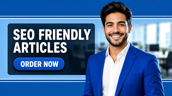
![[Format]
Landscape 16:9 gig cover, banded photographic composite. Clean, corporate, shallow-blur finish. No watermark, no personal names.
[Layout]
The frame divides into three horizontal bands: a mid-blue top band, a lighter blue central band taking roughly the middle third, and a mid-blue bottom band. The central band is edged above and below by thin white hairlines, and a dark translucent panel sits inside it, left-aligned, directly behind the text. Behind all three bands a heavily blurred office scene — chairs, desks, a window — reads as soft background texture. The right ~45% holds a photographic cut-out of a man from the waist up who crosses all three bands, extends off the bottom-right corner, and overlaps the dark panel's right edge.
[Subject]
A young man in his late twenties, dark swept hair, short neat beard and moustache, a bright royal-blue suit jacket over a white open-collar shirt. Waist-up, body angled slightly toward the left, face to camera with a bright open smile showing teeth. Soft even lighting with a subtle rim highlight on the shoulder.
[Headline]
Left side, sitting on the dark panel: "SEO FRIENDLY / ARTICLES" on two stacked left-aligned lines of heavy white uppercase sans-serif, each line roughly a fifth of frame height. Beneath them, a mid-blue rounded pill holds "ORDER NOW" in white bold uppercase, with a soft drop shadow beneath the pill.
[Badges]
None.
[Mood]
Bright, professional and reassuring. Palette: two shades of blue, white and the deep blue of the subject's suit. At thumbnail size the white two-line headline on the dark panel reads cleanly, and the pill button plus the smiling face deliver an uncluttered call to action.](https://files.posterlet.com/assets/generated/md/rxuvtdkm5n4o.webp)
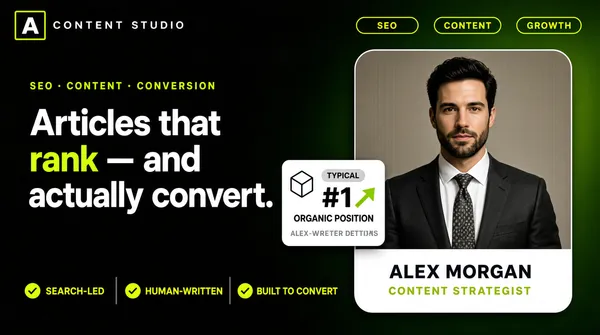
![[Format]
Landscape 16:9 gig cover, dark editorial brand composite. Near-black with a soft dark-green gradient and a premium, restrained finish. No watermark, no personal names.
[Layout]
A very dark ground fades from near-black at the left to a deep moss-green glow at the upper-right, a soft glow behind. A thin strip of small elements runs along the top edge: a small square logo mark holding a single letter at the far top-left beside a short letterspaced caps line, and three small outlined pill badges at the far top-right. The left ~55% stacks top to bottom: a tiny letterspaced lime label, a large three-line headline, and a small floating white stat card that overlaps the headline's lower-right and the portrait card's left edge. The right ~40% is a tall rounded-corner portrait card holding a photographic half-body shot, with a name plate and a role line beneath the image inside the same card. A row of three small check items separated by thin divider bars runs along the bottom-left.
[Subject]
A man in his early thirties, dark hair, neatly trimmed beard, charcoal suit jacket and a patterned tie over a white shirt. Half-body inside the rounded portrait card, facing camera straight on with a calm, assured, neutral expression. Studio lighting against a plain warm-grey card background.
[Headline]
Left column, top to bottom: a small lime letterspaced caps service line with dots between the tags; then the main headline in a heavy contemporary sans across three lines — "Articles that" in white, "rank" in lime green, "— and" in white, then "actually convert." in white on the third line, so "rank" is the only coloured word. Inside the portrait card, beneath the photo, a white plate holds a bold name set in dark type (render as a neutral placeholder name of similar length) with a smaller letterspaced lime role line beneath it.
[Badges]
A small square logo mark containing one letter at the top-left beside a short letterspaced caps line; three small lime-outlined pill badges at the top-right; a small white stat card carrying a rounded icon, a grey "TYPICAL" pill, a large "#1", a green rising arrow and a short metrics line; three small lime check items with thin divider bars along the bottom-left.
[Mood]
Dark, editorial and quietly premium. Palette: near-black, deep moss green, lime green and white, with warm grey from the portrait. At thumbnail size the one lime word and the glowing green stat card are the only bright points, making the cover feel exclusive.](https://files.posterlet.com/assets/generated/md/k380vokfd739.webp)
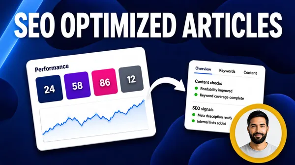
![[Format]
Landscape 16:9 gig cover, software-dashboard composite over a dark blue ground. Techy, data-driven finish with soft glow. No watermark, no personal names.
[Layout]
A deep blue ground carries large soft dark-navy blobs drifting across the top and lower-right, with a lighter blue diagonal streak near the top-left. A huge white headline spans the very top of the frame nearly edge to edge. Below it, two white rounded interface cards float in a shallow 3D tilt: a larger analytics card on the left showing four coloured metric tiles above a wide line chart, and a smaller content-analysis card on the right showing a tab row and two stacked sections. A large white curved arrow sits between the cards, bending so its head points at the bigger left card. In the bottom-right corner a circular photographic portrait sits on a flat mustard-yellow disc, partially overlapping the right card.
[Subject]
A man in his early thirties, dark hair, full dark beard, plain light-grey tee. Head-and-shoulders inside the circular crop, facing camera straight on with a relaxed half-smile. Even soft lighting against a plain background inside the circle.
[Headline]
Across the top, spanning nearly the full frame width at roughly a sixth of frame height, in very heavy white uppercase sans-serif: "SEO OPTIMIZED ARTICLES". The left card carries small dark interface type reading "Performance" above a row of four coloured metric tiles (dark blue, purple, pink and grey) each holding a small white number, with a blue line chart filling the lower half. The right card carries a short row of tab labels and two headed sections of small dark UI text, each bullet line marked with a tiny green status dot.
[Badges]
Two generic white dashboard cards with coloured metric tiles, status dots, tab rows and sparkline charts; one large white curved pointer arrow; one flat mustard-yellow disc behind the portrait. Every interface label is generic placeholder UI copy with no real product branding.
[Mood]
Analytical, technical and evidence-led. Palette: deep blue, navy, white, plus blue/purple/pink accent tiles, green status dots and one mustard disc. At thumbnail size the huge white top line and the two white cards read as proof of measurable results, with the yellow disc portrait adding a human corner.](https://files.posterlet.com/assets/generated/md/dov9iujf09wd.webp)
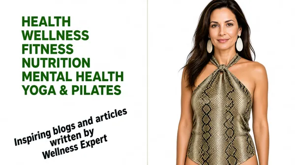
![[Format]
Landscape 16:9 gig cover, clean white split composite with a cut-out portrait. Bright, editorial, high-key finish. No watermark, no personal names.
[Layout]
A pure white ground fills the frame and is divided by a single thin pale vertical rule at about 58% across, running the full height. The left column holds two separate blocks of type: an upper block of stacked single words, and a lower block set on a diagonal. The right column carries a photographic cut-out of a woman on the same white ground with no border, extending from the top edge down to about the hip. Wide white space separates every element; there is no overlap and no third graphic device anywhere in the frame.
[Subject]
A woman in her thirties, long dark-brown hair, a snake-print halter-neck top knotted at the neck, large pale drop earrings. Crop from the crown of the head to mid-thigh, standing, body angled slightly toward the left with the face turned to camera in a soft closed-mouth smile. Bright even light so she reads almost as a studio cut-out against the white.
[Headline]
Left column, upper block: six stacked lines of bold uppercase mid-green sans-serif, right-aligned so their right edges align against the vertical rule and their left edges step inward, forming a descending staircase down the column: "HEALTH", "WELLNESS", "FITNESS", "NUTRITION", "MENTAL HEALTH", "YOGA & PILATES". Left column, lower block: three lines of dark-teal bold italic text rotated about 20 degrees counter-clockwise, left-aligned within the rotation, reading "Inspiring blogs and articles", "written by", "Wellness Expert", with the middle line indented furthest to the right.
[Badges]
None.
[Mood]
Clean, healthful and quietly confident. Palette: pure white, a fresh mid-green for the stacked words and a darker teal for the tilted line, plus the muted snakeskin tones of the subject. At thumbnail size the green staircase of words on white reads instantly while the tilted italic line adds a little movement.](https://files.posterlet.com/assets/generated/md/bbid3qtmiyyh.webp)
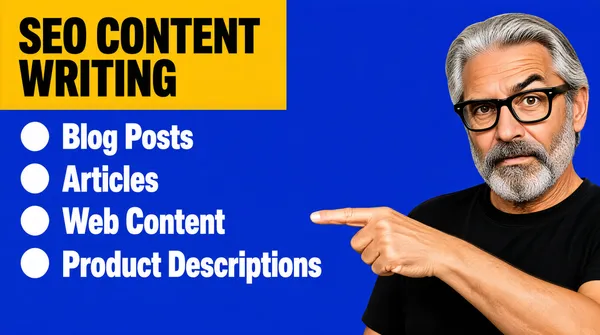
![[Format]
Landscape 16:9 gig cover, flat bold typographic composite with a photographic cut-out. Simple, high-contrast, no-texture finish. No watermark, no personal names.
[Layout]
A solid royal-blue field fills the entire frame with no gradient, texture or photograph behind it. A bright mustard-yellow rectangle sits at the top-left, aligned to the left margin of the frame. Beneath it the composition opens into a bulleted list with a consistent bullet column at the left and a deliberately ragged right edge. The right ~40% holds a photographic cut-out of an older man, head-and-shoulders plus upper chest, extending off the right frame edge; his raised arm and pointing index finger reach into the centre of the frame and aim at the list. All edges are hard and flat, with no drop shadows.
[Subject]
An older man with swept-back silver-grey hair, thick glossy black-framed glasses, a salt-and-pepper beard and moustache, wearing a plain black crew-neck tee. Head-and-shoulders, body angled toward the left, head tipped slightly forward with a raised-eyebrow, faintly quizzical expression. His right arm comes up across the lower-right of the frame and the index finger points left directly at the bulleted list.
[Headline]
Top-left: a mustard-yellow rectangle holds "SEO CONTENT WRITING" in heavy black uppercase, filling the plate edge to edge. Below it, a four-item bulleted list in bold white grotesque, each item preceded by a large solid white round bullet, left-aligned with generous leading and a clearly ragged right edge: "Blog Posts", "Articles", "Web Content", "Product Descriptions".
[Badges]
None — the yellow plate and the four white round bullets are the only graphic devices.
[Mood]
Blunt, cheerful and direct. Palette: royal blue, mustard yellow, white and black. At thumbnail size the yellow plate and the four white list lines read in a single glance, while the pointing figure works as a visual arrow driving the eye toward the offer.](https://files.posterlet.com/assets/generated/md/5gc4yacwpn73.webp)
![[Format]
Landscape 16:9 gig cover, gradient poster composite with a photographic cut-out. Vibrant, modern finish. No watermark, no personal names.
[Layout]
A diagonal gradient sweeps from violet at the upper-left through royal blue to a brighter cyan at the lower-right. Decorative halftone dots, small squiggles and a pair of hexagonal pattern patches sit in the top-left and top-right corners as texture. The left ~50% carries a large left-aligned headline stack with a single thin rule below it. The right ~50% holds a soft-cornered mustard-yellow shape sitting behind a photographic cut-out of a man; he extends off the bottom and right edges and overlaps the yellow shape so it reads as a backdrop panel rather than a border.
[Subject]
A man in his late twenties, dark hair pulled back into a small bun, full dark beard and moustache, navy suit jacket over a white shirt with a brown patterned tie. Crop from mid-chest upward, body angled slightly left, face to camera with a calm, composed, mildly friendly expression. A small pale leaf-shaped lapel pin on the jacket. Even studio lighting, no harsh shadow.
[Headline]
Three stacked left-aligned lines in a very heavy uppercase grotesque, each roughly a fifth of frame height: "SEO" in white, "BLOG" in mustard yellow, "CONTENT" in white. Beneath them runs a single thin horizontal orange rule about two-thirds as wide as the headline block.
[Badges]
Corner texture only — halftone dot clusters, small squiggles, two hexagonal pattern patches, and a small pale leaf-shaped lapel pin on the subject's jacket. No business logos.
[Mood]
Modern, energetic and mildly premium. Palette: violet, royal blue, cyan, mustard yellow and white with a thin orange accent line. At thumbnail size the yellow BLOG line wedged inside a white stack pops hard against the gradient, and the yellow backdrop shape pulls the eye to the right.](https://files.posterlet.com/assets/generated/md/xwtk99x7dvek.webp)