

About this collection
Every Fiverr gig lives or dies by a single image. Each cover here respects the real constraints of a gig image - one banner-shaped canvas, high-contrast text, and no clutter that would collapse at small sizes.
These are starting points, not finished listings. Every cover here is built around one idea: a single service promise, set in type large enough to survive being shrunk into Fiverr's search grid. The collection spans roughly thirty service areas — software and app development, design and branding, writing and translation, marketing, audio, data, and business consulting — so you can usually find a layout close to what you sell and adapt it.
Nothing here is a layered design file. Each one is a flat generated image, which is exactly what makes it quick: pick a layout, swap the headline, palette, and icons for your own service, and you have a listing image in a few minutes rather than an afternoon.
What a gig cover actually has to do
A buyer scanning search results sees your cover as a thumbnail no wider than a postage stamp, sitting next to a dozen competitors. That single constraint decides almost everything else:
- One promise, not a service list. "I will fix your WordPress site in 24 hours" reads at thumbnail size. "WordPress | SEO | Speed | Security | Maintenance" turns to mush.
- High contrast between text and background. Thin light type on a pale panel is the first thing to disappear when the image shrinks.
- Three to six words in the headline. Long headlines force small type, and small type is what becomes unreadable first.
- The service visible before reading a word. A layout cue — a device frame, a waveform, a chart, a colour swatch — tells the buyer the category instantly.
Resizing and export
Fiverr publishes its own requirements in the uploader, and they change - check them there rather than trusting a number quoted in a blog post. What does not change is the direction of the resize: always scale down from the download. Never upscale a smaller image to reach the uploader's width, because the text edges go soft, and soft type is exactly what a thumbnail cannot afford.
When you trim to match the uploader's proportions, do it symmetrically and keep the headline centred, so the crop does not eat one side of the promise.
Three things worth doing before you upload
- Judge the thumbnail, not the full-size file. Shrink the preview down to search-result size, or just squint. If the promise still reads, the cover works. 2. Keep a colour system across your gigs. Buyers skim a grid of near-identical covers; a consistent accent colour makes your listings recognisable among strangers. 3. Leave the outer margin clear. Gig images get cropped slightly differently across placements, so keep text away from the outer edge of the canvas.
Common questions
Will the downloaded cover meet Fiverr's upload requirements?
Check the uploader: Fiverr shows its current accepted format, file limit and recommended image spec there, and those are the platform's requirements, not ours. What matters on this side is direction — start from the downloaded cover and scale down to fit, never up from a smaller file.
Will the text still be readable in the search grid?
Shrink it to search-result size before uploading. That is close to what buyers actually see when comparing gigs, and it is where most covers fail — usually because the headline was set too small or the contrast was too low to begin with.
How many images should one gig have?
Fiverr's gallery takes up to three images and two videos. Lead with the strongest cover, then spend the remaining slots on a work sample, a before-and-after, or a deliverable preview rather than more headline art.
Can I use the same cover on several gigs?
No. Buyers often see two or three of your gigs together, and identical covers make them look like one listing repeated. Change the headline, the accent colour, and the main visual so each gig reads as its own service.
Can I change the text or colours after generating?
Not in place. The wording is baked into the image, so there is no text layer to retype. Download it and edit it in your own tool, or use the "Use as Template" option to regenerate it with different copy.
Why do the covers in this collection look so different from each other?
Because the range is deliberately broad. Each cover was written around the specific service it advertises, so a logo animation cover and a translation cover share a job — selling one service at thumbnail size — but not a visual style. That variety is what lets you give every gig a distinct look.
![[Format]
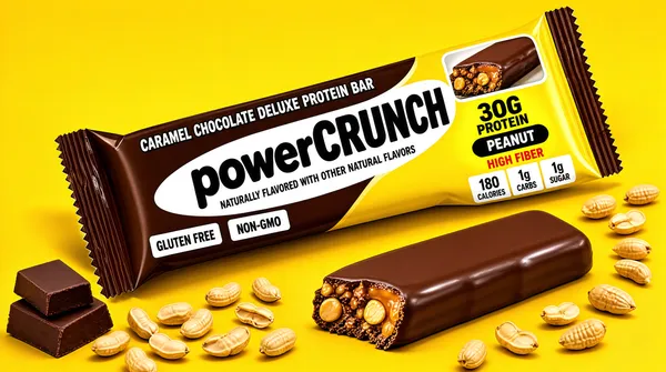
Landscape 16:9 gig cover, punchy commercial snack-bar product photography on a solid colour sweep. Studio lighting with a crisp directional shadow and high saturation. No watermark, no personal names.
[Layout]
Flat saturated sunflower-yellow seamless background filling the whole frame. The composition runs on a diagonal: a long flow-wrap bar package lies at roughly thirty degrees from lower-left to upper-right across the centre, its crimped fin seals splayed at both ends. Below and to the right of it, in the same diagonal direction, a second opened bar with a bite taken out rests on the surface. Scattered at the lower-left are two stacked chocolate chunks, and a loose scatter of shelled peanuts runs across the bottom-left and mid-right. The wrapper body splits into a dark chocolate-brown panel on the upper-left half and a bright yellow panel on the lower-right half, with a small photo window of the cut bar at the upper-right. Everything casts soft directional shadows onto the yellow ground.
[Subject]
None — packaging plus food styling. The subject is the wrapped bar and the bitten bar lying beside it. The wrapper shows a photoreal chocolate-coated bar with a nut-and-caramel cross-section visible through the sleeve.
[Headline]
On the wrapper, "CARAMEL CHOCOLATE DELUXE PROTEIN BAR" runs in small white uppercase along the brown panel, above a large bold brand wordmark set black on a white swoosh area — a private two-word maker mark that reads here as a heavy rounded lowercase word joined to a bold caps word. Beneath it a thin caps line reads "NATURALLY FLAVORED WITH OTHER NATURAL FLAVORS". On the yellow half, "30G PROTEIN" sits in heavy black caps with a yellow spotlight, "PEANUT" in a black lozenge, "HIGH FIBER" in red caps on a yellow ribbon, and three stacked stat blocks read "180 CALORIES", "1g CARBS" and "1g SUGAR" in heavy black over white plates.
[Badges]
No platform badges. On-pack only: two small white rectangles reading "GLUTEN FREE" and "NON-GMO" side by side on the brown panel.
[Mood]
Palette is saturated sunflower yellow, deep chocolate brown, cream and black with red accents. Bold, energetic and appetite-driven. At thumbnail size the diagonal bar on flat yellow with the bold wordmark reads instantly as a snack-bar cover.](https://files.posterlet.com/assets/generated/md/9cmya1j92m0h.webp)
![[Format]
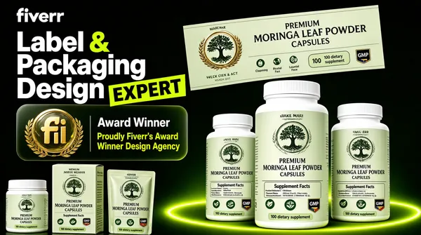
Landscape 16:9 gig cover, dark premium supplement-and-label presentation with a floating printed label spread. High-contrast studio lighting, glossy render on the bottles, soft glow behind the group. No watermark, no personal names.
[Layout]
Very dark near-black forest-green background with a subtle vignette. A bright lime-green elliptical glow sits low-centre behind the products and acts as a stage. Top-left is a two-part text block: the lowercase "fiverr" wordmark in solid white, then a large stacked headline below it. Left-centre, a rounded translucent panel floats with two lines of award copy and, to its left, a small gold-and-glass coin emblem ringed by laurel wreaths. Top-right, a wide flat printed wrap label is shown floating and slightly angled at a larger scale than the bottles. Across the bottom-right a trio of white supplement bottles with pale sage labels stands front-facing, the centre bottle largest and forward, the outer two slightly behind. Bottom-left, a small cluster of three secondary packs — a small jar, a printed carton and a standing sachet pouch — sits lower and is partly cropped. Depth reads through the dark drop-off, the green glow and bottle shadows overlapping the lit ellipse.
[Subject]
None — typographic plus packaging. The bottles are opaque white plastic with ribbed screw caps and matte wrap labels carrying a small circular botanical tree medallion, a stacked maker wordmark, a product line, a "Supplement Facts" panel, a row of leaf-and-icon callouts and a "100 dietary supplement" chip.
[Headline]
Top-left "fiverr" wordmark in white lowercase. The stacked headline reads "Label", "Packaging" and "Design" in large white bold sans on three lines with a large lime-green ampersand between the first two, and "EXPERT" in heavy black uppercase on a bright lime-green skewed plate overlapping the lower right of the stack. The floating award panel reads "Award Winner" in white and "Proudly Fiverr's Award Winner Design Agency" in lime green. The bottle labels read "PREMIUM MORINGA LEAF POWDER CAPSULES" in stacked green serif and caps with small percentage callouts.
[Badges]
Fiverr's gold-and-glass "fi" coin emblem sits inside the award panel at left with laurel branches, and the Fiverr wordmark appears once, top-left. On the labels: small botanical tree medallions, a row of green product-claim icons, plus GMP and a small flag shield chip.
[Mood]
Palette is near-black forest green, bright lime, clean white and accents of gold. Confident, certified and sales-forward. At thumbnail size the huge white stacked headline, the lime ampersand and the green glow read as a top-rated expert cover.](https://files.posterlet.com/assets/generated/md/lczns6wg8xqi.webp)
![[Format]
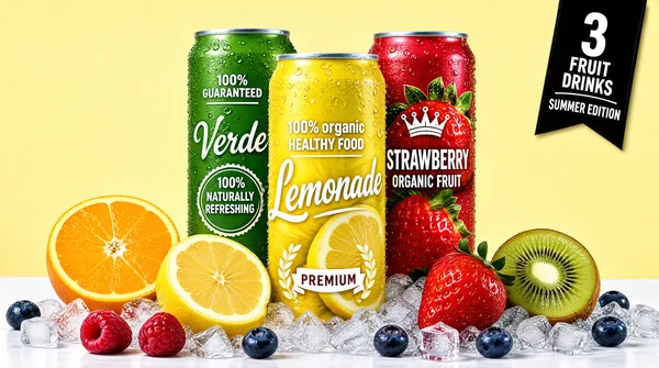
Landscape 16:9 gig cover, glossy beverage-can product photography on a pale studio ground. Commercial studio lighting with crisp metallic highlights and cold-condensation sparkle. No watermark, no personal names.
[Layout]
Flat pale butter-yellow seamless background with a broad white foreground ledge on which fresh fruit and a bed of crushed ice are arranged. Three tall slim aluminium cans stand in a centred cluster, the yellow centre can forward and lowest, the green can behind-left and the red can behind-right, so the outer two are partly occluded by the middle one. The cans are identical in proportion — tall, narrow, plain silver rim, matte printed body. Fruit and ice fan out symmetrically at the base: a split orange at the left, a half lemon leaning against the front can, a strawberry and a kiwi half at the right, with raspberries, blueberries and ice cubes spread across the ledge. A small black ribbon banner with a numeral is pinned to the top-right corner, angled slightly. Depth comes from the fruit overlapping the can bases and from soft shadows on the white ledge.
[Subject]
None — three canned drinks plus fresh produce. The green can carries a small circular seal and a scripted product word; the yellow front can shows a full-bleed photo of lemons and water droplets under a large script headline; the red can shows a photo of strawberries with a small crown-and-pennant emblem above its headline.
[Headline]
Green can: "100% GUARANTEED" in small white caps above a scripted product word rendered as a short cursive flavour name, plus a fine line of copy. Yellow front can: "100% organic" in tiny caps, then "HEALTHY FOOD" in small white caps, then a very large cream script "Lemonade", with "PREMIUM" and a laurel-and-banner emblem low on the can. Red can: "STRAWBERRY" as a bold condensed red wordmark over the fruit photo, with "ORGANIC FRUIT" in caps below and a tiny crown-and-pennant ornament above. The top-right black ribbon carries a large numeral above a short two-line uppercase banner wordmark and a curved caption arc.
[Badges]
No platform badges. On-can only: a small circular "100% guaranteed" seal on the green can and a crowned-pennant emblem on the red can.
[Mood]
Palette is pale butter yellow with saturated lemon yellow, grass green, cherry red and glossy fruit tones. Fresh, summery and thirst-quenching. At thumbnail size the three-colour can trio plus bright fruit reads instantly as a fruit-drink range.](https://files.posterlet.com/assets/generated/md/lner9bky97jl.webp)
![[Format]
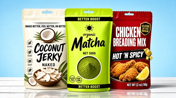
Landscape 16:9 gig cover, three stand-up pouch mockups staged on a light studio set. Clean product render, soft diffused light, subtle reflection on the board below. No watermark, no personal names.
[Layout]
Background is a smooth pale sky-blue gradient wall meeting a white painted-wood plank surface across the lower third, the plank lines running horizontally to give a shallow depth cue. Three large stand-up pouches stand in a staggered row across the centre, slightly overlapping so the middle pouch sits in front and occludes part of the two flanking packs; the left pouch is set a little forward and the right pouch a little lower. Each pouch is a tall rounded stand-up with a crimped top tear-notch and a matte finish. Left pouch is white and earthy with botanical leaf illustrations and a coconut photo; centre pouch is flat lime green with a small sun mark and an ingredient photo window low-centre; right pouch is deep red with a shield-style food badge and a fried-chicken photo panel at bottom-right. All three cast soft grey shadows and a faint mirrored reflection on the boards.
[Subject]
None — three standalone pouch packs. The left pouch shows a photoreal halved coconut at its top and a bowl of dried white chips low; the centre shows a round window of green matcha powder set into the lower half; the right shows breaded chicken pieces with a yellow lemon wedge.
[Headline]
The left pouch headline is "COCONUT JERKY" in large black brush script over an off-white field with "NAKED" beneath in small caps and a thin benefit line above a phrase strip reading "SNACK BETTER, FEEL BETTER, DO BETTER". The centre pouch headline is a large black italicised "Matcha" with a small script "organic" above it, "BETTER BOOST" repeated in a thin banner across the very top and again near the base, and "NET 500G" low centre. The right pouch headline is "CHICKEN BREADING MIX" in heavy white condensed uppercase over red, with "HOT 'N SPICY" on a black skewed plate and "NET WT (2 oz) 56g" low right. Each pouch also carries a short maker wordmark of modest weight, the centre one in the upper third and the right one as a small comic-style badge.
[Badges]
No platform badges. On-pack only: a small circular gluten-free/non-GMO claim pair low-left on the centre pouch, tiny ingredient icons down the left pouch, and a gold ribbon element on the right pouch's mascot badge.
[Mood]
Palette runs earthy white and brown, a punchy lime green and a hot red over a calm sky-blue backdrop. Bright, shelf-ready and playful. At thumbnail size the green centre pouch and the red right pack frame the neutral left pack neatly.](https://files.posterlet.com/assets/generated/md/k4ihbzb7veg9.webp)
![[Format]
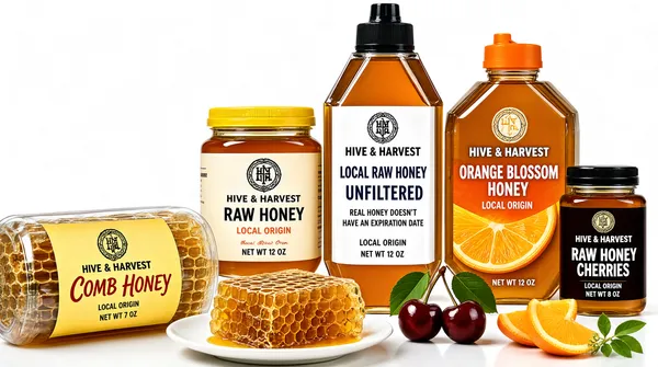
Landscape 16:9 gig cover, high-key commercial product photography of a honey range on seamless white. Studio softbox lighting, glossy highlights, faint reflections under the vessels. No watermark, no personal names.
[Layout]
White seamless studio sweep with a low horizon, the products grouped in a tight overlapping cluster occupying the centre-right and leaving air at the left and top. Back rank: a squat glass jar with a yellow metal lid at left, a tall hexagonal squeeze bottle with a black cap standing tallest at centre, and a broad-shouldered hexagonal bottle with an orange flip cap at right. Front rank, lower and overlapping the jars: a clear plastic tub of cut comb honey with a yellow wrap label lying at the lower-left and cropped by the frame edge. Foreground props spread along the bottom edge — a chunk of raw honeycomb on a white plate, two glossy dark cherries with green leaves, two cut orange wedges and a small sprig. Depth comes from the staggered ranks, cast shadows and the pale reflections of the jars on the white floor; the upper text zone stays empty.
[Subject]
None — packaging and produce only. The glass vessels are filled with glowing amber honey and each carries a printed paper label: a small circular monogram crest above a stacked maker block, then a bold product line, a fine origin line and a net-weight line. Labels are cream, black, orange and yellow.
[Headline]
All type lives on the labels. The tall centre bottle reads "LOCAL RAW HONEY UNFILTERED" in bold navy uppercase on white, with "REAL HONEY DOESN'T HAVE AN EXPIRATION DATE" in tiny script beneath. The right bottle reads "ORANGE BLOSSOM HONEY" in large white uppercase over a photo of orange slices; the far-right jar reads "RAW HONEY CHERRIES" in white over cherries; the lower-left tub reads "COMB HONEY" in red script caps. Every label carries a small circular monogram crest and a short script origin line. The maker block is a private name and reads here as a short two-line uppercase maker lockup of similar length.
[Badges]
No platform badges. On-pack only: small circular natural-honey style medallion crests at the head of each label and tiny net-weight chips at the foot.
[Mood]
Palette is warm amber honey, cream, black and accents of orange and cherry red on white. Warm, artisanal and premium. At thumbnail size the glowing amber jars with dark cherries pop cleanly off the white sweep.](https://files.posterlet.com/assets/generated/md/jfyvnos7fxg8.webp)
![[Format]
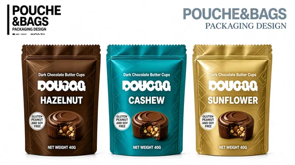
Landscape 16:9 gig cover, clean flat product-mockup presentation on a seamless studio white. Crisp commercial render, soft contact shadows, even diffuse lighting. No watermark, no personal names.
[Layout]
Pure white seamless background divided into a light top band and a lower product band. The top band carries two text groups: extreme top-left a black stacked logo lockup — two huge ultra-condensed uppercase words set on two lines and tilted a few degrees, with a thin vertical hairline rule running past them and a tiny grey tagline plus a small circled monogram beneath. Extreme top-right, a huge light-grey bold wordmark reads "POUCHE&BAGS" with a smaller light serif line "PACKAGING DESIGN" beneath it, right-aligned. The lower two-thirds is a single horizontal row of three identical stand-up foil pouches, centred, evenly spaced with a narrow gutter, equal height, each with a serrated crimped top and bottom seal and a subtle tonal geometric line pattern across its body. The row reads left to right as a matched flavour set, front-facing with no overlap, each pouch casting a faint soft shadow on the white floor.
[Subject]
None — product mockups only: three sealed stand-up pouches standing upright. Each pouch front carries, top to bottom, a white brand wordmark whose first word is set very large with two round dots above its centre letter, then two lines of small white subtitle, then a larger white flavour word, and a photoreal nut-butter cup with one bite taken resting bottom-centre; a small circular claim disc sits low-left. Left pouch is warm chocolate brown, centre pouch bright teal blue, right pouch muted metallic gold.
[Headline]
Top-left lockup: two enormous ultra-condensed black uppercase words stacked and slightly rotated, then a thin tagline. Top-right: "POUCHE&BAGS" in huge bold light-grey sans, with "PACKAGING DESIGN" in small light-grey uppercase serif beneath. On the pouches the flavour words read "HAZELNUT", "CASHEW" and "SUNFLOWER" in large bold white uppercase; a small white subtitle line above each reads "Dark Chocolate Butter Cups"; the low discs read "GLUTEN PEANUT AND SOY FREE" in tiny white uppercase; "NET WEIGHT 40G" sits at the bottom edge in tiny white type.
[Badges]
No platform badges. On-pack only: a small circular gluten/peanut/soy-free claim disc low on the left of every pouch, and a tiny circled monogram inside the top-left studio lockup.
[Mood]
Palette is warm chocolate brown, saturated teal blue and soft metallic gold against pure white, with grey display type floating above. Clean, catalogue-like and appetising. At thumbnail size the three-colour pouch row reads instantly as a flavour family under one big grey wordmark.](https://files.posterlet.com/assets/generated/md/fvqdbqjcl6t2.webp)
![[Format]
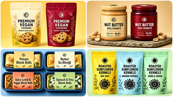
Landscape 16:9 gig cover, clean product mockup montage with rounded corners on each quadrant and soft studio lighting. Friendly food-brand finish. No watermark, no personal names.
[Layout]
The frame is divided into a 2x2 grid with rounded-corner panels and a narrow white gutter. Top-left: two cookie pouches. Top-right: two nut-butter jars. Bottom-left: four pre-packaged food trays. Bottom-right: three chip-style bags. Each quadrant has its own color-matched background.
[Subject]
Top-left: two cream-to-gradient stand-up pouches with botanical line art and cookie photos, one in warm yellow, one in berry red. Top-right: a light tan nut-butter jar with bold foreign-language caps and a deep red berry jar with foreign-language caps, both on a stone slab with peanuts. Bottom-left: four rectangular food trays with blue rims, each with a colored paper sleeve and a photo of rolled pastries. Bottom-right: three seed bags in yellow, light blue, and mint green with a sun logo and black seed graphics.
[Headline]
Each quadrant uses its own packaging text. Cookie pouches: a bold serif brand wordmark and "PREMIUM VEGAN COOKIES". Nut-butter jars: a small brand wordmark on the lid, a large foreign-language product name, and a percentage nutrition line. Food trays: a brand wordmark and product names like "Potato Börek Rolls", "Butter Su Böreği", "Spicy Lentil & Veggie Börek Rolls", "Spinach & Feta Börek Rolls". Seed bags: a brand wordmark with sun icon and "ROASTED SUNFLOWER KERNELS" plus flavor names.
[Badges]
none
[Mood]
Warm and varied food palette: golden yellow, berry red, peanut tan, deep red, blue tray rims, and fresh yellow/blue/mint. The 2x2 grid communicates breadth of packaging work at thumbnail size.](https://files.posterlet.com/assets/generated/md/yzllj22jparb.webp)
![[Format]
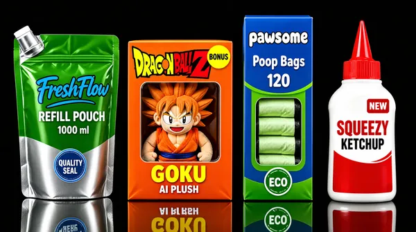
Landscape 16:9 gig cover, photorealistic product mockup style with a pure black background and glossy reflections. Commercial studio finish. No watermark, no personal names.
[Layout]
Four product packages are arranged in a single horizontal line across the center, evenly spaced, each on a reflective black surface. The packages vary in shape: a stand-up pouch, a toy box, a tall thin box, and a squeeze bottle. They fill most of the frame from left to right.
[Subject]
From left: a green-and-silver stand-up pouch with a spout; a bright orange toy box with a clear window showing a smiling spiky-haired character plush in an orange outfit; a blue-and-green boxed product with a die-cut window revealing rolled items; a white-and-red squeeze bottle with a pointed nozzle.
[Headline]
Each package carries its own product typography. Pouch: a large blue script-style brand wordmark, a product-type description, and "1000 ml" net weight. Toy box: a large stylized "DRAGON BALL Z" logo in yellow and red, a bold yellow character name, and "AI PLUSH" below. Blue box: a playful lowercase white brand wordmark, "Poop Bags" in white, and "120" count. Squeeze bottle: a red blocky brand wordmark and product description in red and black.
[Badges]
Pouch has a small circular quality seal. Toy box has a yellow circular sticker in the upper right. Blue box has a small circular icon near the base. Squeeze bottle has a small red badge near the top.
[Mood]
High-contrast palette of black background against green, orange, blue, and red packaging. The variety of package types creates a playful, versatile impression, and the bright colors pop at thumbnail size.](https://files.posterlet.com/assets/generated/md/18m3q6yg5lgv.webp)
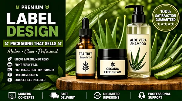
![[Format]
Landscape 16:9 gig cover, photorealistic organic product photography with a blurred green botanical background and warm wood tones. Natural premium finish. No watermark, no personal names.
[Layout]
The left third holds vertical headline text and a service checklist. The right two-thirds shows three transparent cosmetic containers arranged on a thick wooden slab: a dropper bottle on the left, a small jar in the center, and a tall pump bottle on the right. Green leaves and aloe pieces frame the products from behind.
[Subject]
Three glass or plastic containers with cream labels and black caps. Left: amber dropper bottle with a botanical leaf logo and "TEA TREE Essential Oil" text. Center: short black jar with a leaf logo and "ORGANIC FACE CREAM". Right: tall clear pump bottle with aloe leaf graphics and "ALOE VERA SHAMPOO".
[Headline]
Top-left: small green sans-serif caps "PREMIUM" flanked by two leaf icons. Below, huge bold white sans-serif caps "LABEL" stacked above large bold green sans-serif caps "DESIGN". Under that, a green banner with leaf icons reads "PACKAGING THAT SELLS". A script line below says "Modern • Clean • Professional". Left column checklist with leaf, printer, HD, box, and document icons lists "UNIQUE & PREMIUM DESIGNS", "PRINT READY FILES", "HIGH RESOLUTION PRINT QUALITY", "FREE 3D MOCKUPS", "SOURCE FILES INCLUDED". Bottom bar: icons for "MODERN CONCEPTS", "FAST DELIVERY", "UNLIMITED REVISIONS", "PROFESSIONAL SUPPORT".
[Badges]
Upper-right: a circular olive badge reading "100% SATISFACTION GUARANTEED" with five stars.
[Mood]
Rich green and earthy brown palette with cream label space and black accents. The mood is organic, trustworthy, and premium, with the botanical framing making it read as natural skincare at thumbnail size.](https://files.posterlet.com/assets/generated/md/8eduleeazz9w.webp)
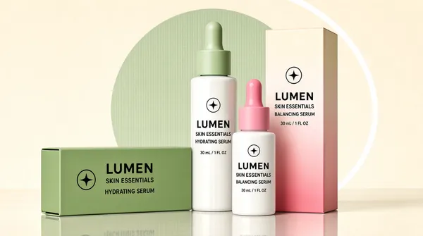
![[Format]
Landscape 16:9 gig cover, minimalist 3D cosmetic mockup with soft pastel studio lighting. Clean editorial finish. No watermark, no personal names.
[Layout]
The products form a small pyramidal cluster slightly right of center on a reflective surface. A green rectangular box lies on its side in the foreground-left; a taller white dropper bottle stands behind it; a shorter white dropper bottle stands in front-right; a tall pink ombre box stands behind-right. A large pale sage-green circle and a thin white arc decorate the background.
[Subject]
Two white dropper bottles with colored caps—one light green and one bright pink—and matching product labels; one green skincare box lying horizontally; one tall pink gradient box standing vertically. All display a clean sans-serif brand wordmark, a star-in-circle logo, and a product line name in small caps.
[Headline]
No large overlay headline. Product labels carry the brand wordmark in large black sans-serif caps, followed by a product line name in smaller caps, with a circular star badge and tiny descriptive text lines.
[Badges]
none
[Mood]
Soft palette of cream, sage green, pastel pink, and white with gentle shadows. The mood is fresh, clean, and premium-skincare, and the pastel blocks stand out clearly at thumbnail size.](https://files.posterlet.com/assets/generated/md/sfndjsbpp872.webp)
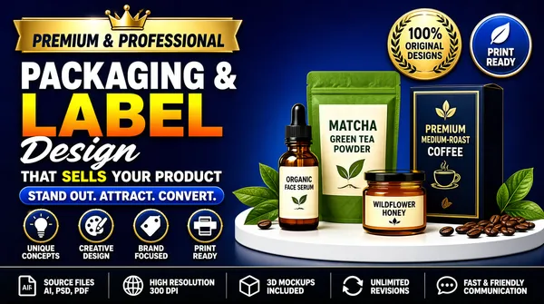
![[Format]
Landscape 16:9 gig cover, glossy 3D product mockup style with a deep blue gradient background and bright product spotlights. High-saturation commercial finish. No watermark, no personal names.
[Layout]
The left half holds large headline typography and service icons; the right half shows a small product still life on a white curved platform. A dark bottom bar spans the full width with six small service callouts. Two trust badges float in the upper-right corner above the products.
[Subject]
Four packaging mockups on a white semi-circular platform: a small amber dropper bottle labeled for organic face serum, a green-and-cream stand-up pouch labeled for matcha green tea powder, a small amber jar labeled for wildflower honey, and a dark blue upright box labeled for premium medium-roast coffee. Green leaves and coffee beans accent the scene.
[Headline]
Top-left on a gold banner with a crown icon: "PREMIUM & PROFESSIONAL". Below that, huge white bold sans-serif caps read "PACKAGING &", then "LABEL" in even larger gradient yellow-to-orange caps, and a flowing white script word "Design" underneath. Under the headline, white sans-serif text reads "THAT SELLS YOUR PRODUCT" with "SELLS" highlighted in yellow. A blue pill-shaped banner says "STAND OUT. ATTRACT. CONVERT." Four circular icons below are labeled "UNIQUE CONCEPTS", "CREATIVE DESIGN", "BRAND FOCUSED", "PRINT READY". Bottom bar has icons and labels: "SOURCE FILES AI, PSD, PDF", "HIGH RESOLUTION 300 DPI", "3D MOCKUPS INCLUDED", "UNLIMITED REVISIONS", "FAST & FRIENDLY COMMUNICATION".
[Badges]
Upper-right: a gold laurel wreath badge reading "100% ORIGINAL DESIGNS" and a blue badge with a leaf icon reading "PRINT READY".
[Mood]
Bold blue gradient background with bright yellow, orange, and white accents, plus green from the product labels. The mood is energetic, sales-driven, and professional, reading clearly as a packaging-service cover at thumbnail size.](https://files.posterlet.com/assets/generated/md/spzkdz3c32ag.webp)
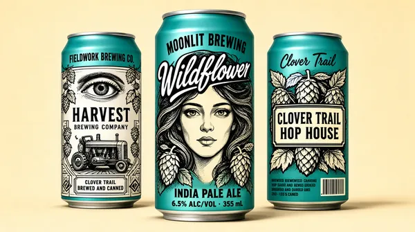
![[Format]
Landscape 16:9 gig cover, illustrated craft-beer can mockup style with hand-drawn artwork and soft studio lighting. Matte pastel background. No watermark, no personal names.
[Layout]
Three tall aluminum cans stand in a loose horizontal group across the middle, slightly angled toward the viewer, with the center can pushed forward. They are evenly spaced against a pale warm background and cast soft shadows beneath them.
[Subject]
Three teal-colored beer cans with black-and-white illustrative graphics. Left can shows an eye above a vintage tractor engine, with hops and geometric lines. Center can features a large stylized woman's face surrounded by flowing hair and hop cones, with a bold script brand name across the top. Right can shows hop cones and leaves with a blocky brewery logo badge.
[Headline]
Left can: a small brewery name in black caps at top; a large black serif brand wordmark in the middle, with "BREWING COMPANY" in a smaller badge below. Center can: an arched brewery name at top; a large white script brand name with black drop shadow; lower section shows a beer-style descriptor and alcohol percentage plus volume in blocky caps. Right can: a script brand name at top; a blocky brewery logo badge in the center; a barcode and small legal text near the base.
[Badges]
none
[Mood]
Cool teal and cream palette with heavy black linework, giving a craft-brewery, retro-illustration feel. The center face and bold script name make the trio distinctive at thumbnail size.](https://files.posterlet.com/assets/generated/md/hg1mg3978y15.webp)
![[Format]
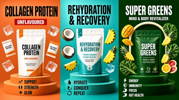
Landscape 16:9 gig cover, photorealistic 3D product scene with bold color-blocked panels and studio-rendered lighting. Vibrant commercial finish. No watermark, no personal names.
[Layout]
The frame is divided into three equal vertical panels with no gutter, each panel distinguished by its own background color. Each panel centers a product pouch on a stepped pedestal, with small floating ingredient pieces scattered around. The color change itself creates the panel separation.
[Subject]
Left panel (terracotta background): a white pouch with orange accents, surrounded by floating sachets and clear cubes. Center panel (teal background): a white and teal pouch with floating coconut pieces and pineapple wedges. Right panel (deep green background): a dark green pouch with mango, pineapple, kale, and fruit slices floating around an arched frame.
[Headline]
Each panel repeats a bold sans-serif brand wordmark at the top. Left panel: "COLLAGEN PROTEIN" in large black caps, with "UNFLAVOURED" on a red badge and benefit words "SUPPORT", "STRENGTH", "GLOW" with small icons. Center panel: "REHYDRATION & RECOVERY" in teal caps, with bullet benefits "HYDRATE", "CONQUER", "REPEAT". Right panel: "SUPER GREENS" in white caps, with "MIND & BODY REVITALIZER" and icons for "ENERGY", "IMMUNITY", "FOCUS", "GUT HEALTH".
[Badges]
none
[Mood]
Vibrant tri-color palette of terracotta orange, ocean teal, and deep forest green, each panel matched to its flavor. The image feels energetic and wellness-focused, with the three panels creating a strong story at thumbnail size.](https://files.posterlet.com/assets/generated/md/p9dwa8mnqkz7.webp)
![[Format]
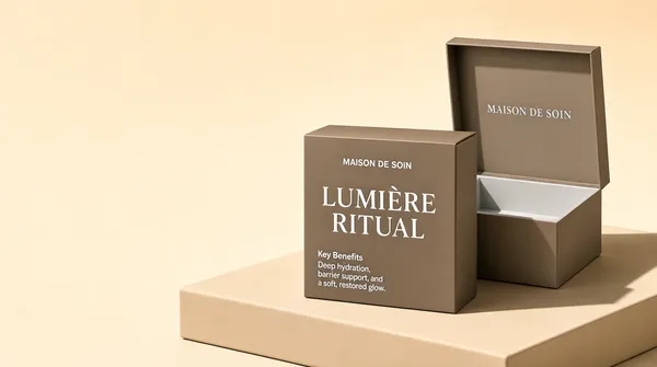
Landscape 16:9 gig cover, soft 3D mockup photography with gentle shadows and a warm beige studio background. Premium minimalist finish. No watermark, no personal names.
[Layout]
Two square skincare boxes occupy the right two-thirds of the frame on a low beige platform. The left box is closed and sits slightly forward; the right box is open behind it with its lid raised. A strong diagonal shadow stretches from the left box across the platform. The left third is clear beige negative space.
[Subject]
Two matte taupe skincare boxes. The closed front box displays a large elegant white serif brand wordmark, a smaller sans-serif sub-brand name, and a short "Key Benefits" paragraph. The open box behind repeats the brand wordmark on the inside lid and shows an empty light-gray interior.
[Headline]
On the closed box: a large white serif brand wordmark stacked in two lines; a smaller sans-serif sub-brand name centered above it; a small "Key Benefits" heading with light gray descriptive text on the left face. Inside the open lid, the same sub-brand name appears in pale gray serif caps. No large overlay headline is present.
[Badges]
none
[Mood]
Warm neutral palette of beige, taupe, and off-white with soft natural shadows. The mood is calm, premium, and spa-like, and the open box creates visual curiosity at thumbnail size.](https://files.posterlet.com/assets/generated/md/sstloz6en2s8.webp)
![[Format]
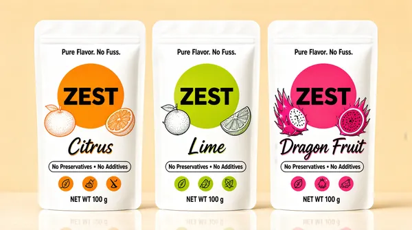
Landscape 16:9 gig cover, clean product photography style with soft even lighting and a pale warm-beige background. Crisp commercial finish. No watermark, no personal names.
[Layout]
Three stand-up pouches stand in a single horizontal row across the center, evenly spaced with a narrow white gutter between them. Each pouch shares the same base layout but swaps the accent color and flavor artwork. The pouches cast soft reflections on the light surface below.
[Subject]
Three matte white stand-up pouches with rounded top seals. Each pouch features a large colored circle behind a short bold black sans-serif brand wordmark. Left pouch has an orange circle with line-art whole and sliced citrus. Center pouch has a lime-green circle with line-art whole and sliced citrus. Right pouch has a hot-pink circle with line-art whole dragon fruit and sliced dragon fruit.
[Headline]
At the top of each pouch, a small black sans-serif tagline reads "Pure Flavor. No Fuss." The central brand wordmark is a short bold black sans-serif name. Below each circle, a curved black script flavor descriptor matches the accent color. A horizontal pill-shaped banner near the bottom states "No Preservatives • No Additives". Three small round benefit icons sit in a row near the base, each filled with the pouch accent color. Net weight appears in small black text at the very bottom.
[Badges]
none
[Mood]
Bright flavor-coded palette of orange, lime green, and hot pink against clean white and warm beige. The image feels fresh, healthy, and approachable, reading as three flavor variants at thumbnail size.](https://files.posterlet.com/assets/generated/md/imab47ybfppa.webp)
![[Format]
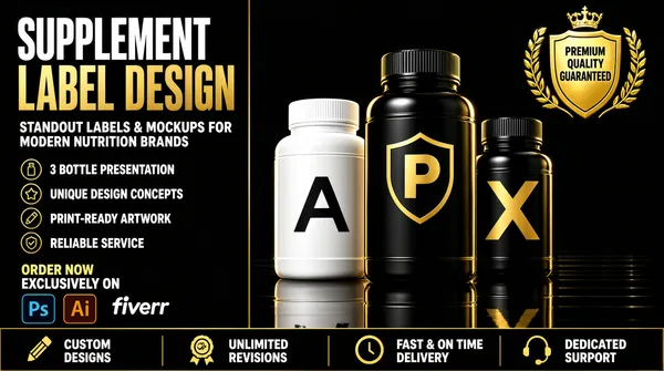
Landscape 16:9 gig cover, photorealistic 3D supplement-bottle mockup style with dramatic rim lighting and a deep black reflective background. High-end glossy finish. No watermark, no personal names.
[Layout]
The frame splits into a left text-and-service column (about one-third) and a right product stage (about two-thirds). Three glossy supplement bottles stand in a slight diagonal on a reflective black surface, with the center bottle tallest and pushed forward. A gold laurel badge floats in the upper-right. A horizontal bottom bar spans the full width with four service callouts and small icons.
[Subject]
Three plastic supplement bottles with ribbed caps. Left bottle is white with a geometric "A" mark and a short bold sans-serif product name. Center bottle is taller black with a shield "P" icon and a short bold sans-serif product name. Right bottle is shorter black with a stylized "X" and a short bold sans-serif product name. All three catch warm gold rim light from the upper right.
[Headline]
Top-left: "SUPPLEMENT" in very large condensed white sans-serif caps, then "LABEL DESIGN" in equally large metallic gold caps directly below. Under that, smaller white sans-serif reads "STANDOUT LABELS & MOCKUPS FOR MODERN NUTRITION BRANDS". A vertical list on the left pairs small circular icons with "3 BOTTLE PRESENTATION", "UNIQUE DESIGN CONCEPTS", "PRINT-READY ARTWORK", and "RELIABLE SERVICE". Bottom-left: "ORDER NOW" in gold caps above "EXCLUSIVELY ON" in white, next to the white "fiverr" wordmark, with small Adobe Photoshop (Ps) and Illustrator (Ai) app icons beneath.
[Badges]
Upper-right: a gold shield framed by a laurel wreath with a crown icon and "PREMIUM QUALITY GUARANTEED" in gold caps. Bottom bar from left to right: "CUSTOM DESIGNS" with a pencil icon, "UNLIMITED REVISIONS" with a rosette icon, "FAST & ON TIME DELIVERY" with a clock icon, "DEDICATED SUPPORT" with a headset icon.
[Mood]
Dark luxury palette of matte black, metallic gold, and clean white with warm highlight accents. The composition reads premium and high-contrast at thumbnail size, with the gold headline and badge drawing the eye.](https://files.posterlet.com/assets/generated/md/94npfhha2420.webp)
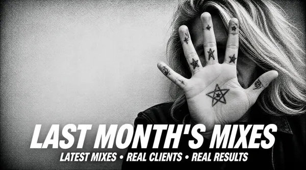
![[Format]
Landscape 16:9 gig cover, high-contrast grayscale duotone photograph with a heavy grain overlay. Desaturated monochrome, vignetted, gritty film texture. No watermark, no personal names.
[Layout]
A full-bleed monochrome photograph with no panels, plates or borders — the whole canvas is the image, softened by a dark vignette at the corners and a speckled film grain laid over everything. A single figure fills the centre-right: long pale hair sweeps across the top-right, and a raised hand with splayed, heavily tattooed fingers covers the face and takes the optical centre of the frame, the fingertips reaching close to the top edge. The bottom-right holds a dark shoulder and jacket. The upper-left is a flat pale grey wall, giving the composition an off-centre balance of empty light grey at the left against the dense figure at the right-centre. The headline sits as two stacked lines across the lower-middle band, laid straight over the photograph and crossing the hand and jaw.
[Subject]
A person in a tight head-and-shoulders crop, long light hair running off the top and right edges, the face hidden behind a raised hand whose splayed fingers carry small dark line tattoos including star and pentagram motifs across the knuckles. Only a sliver of jaw and cheek and a dark jacket shoulder are visible at the lower-right. Flat ambient light off a pale grey wall behind produces almost no modelling; everything resolves as mid-greys with darker tattoo lines and hair.
[Headline]
Centred across the lower-middle of the frame: "LAST MONTH'S MIXES" in a heavy white italic grotesque, all caps, spanning roughly seventy per cent of the frame width; directly beneath it a smaller line of the same white italic caps, letter-spaced, reading "LATEST MIXES • REAL CLIENTS • REAL RESULTS" with round bullet separators between the phrases. Both lines sit flat on the photo with no outline, plate or shadow.
[Badges]
none.
[Mood]
Monochrome — silver, mid-grey, charcoal and bone white. Raw, understated and anti-polish. At thumbnail size it reads as a grey grainy portrait with two lines of bold white italic type laid across the middle.](https://files.posterlet.com/assets/generated/md/b3twc5gvesld.webp)
![[Format]
Landscape 16:9 gig cover, glossy 3D-rendered music-promo graphic. Beveled chrome-and-gold display type with bloom and lens streaks over a tiled foam backdrop, high polish. No watermark, no personal names.
[Layout]
A deep purple backdrop tiled edge to edge with a repeating 3D pyramid-and-diamond acoustic-foam pattern, each facet lit so it has a bright top edge and a dark base, with a soft radial darkening toward the corners. The left half carries a stacked typographic composition centred on a slight rising diagonal: a small word at the top, then a huge two-word line, then a single very large word beneath it, then a horizontal metallic plate. A soft diagonal light streak crosses the backdrop behind the type. On the right a cut-out portrait sits over the foam wall, cropped hard by the right and bottom edges so the shoulder bleeds off-canvas, its silhouette overlapping the patterned background. The plate at the lower-left is the only solid panel in the composition, and a warm lens flare grazes the join between type and face.
[Subject]
A young Black man in his mid-twenties with short braided hair pulled back and a full beard, wearing thin round wire-frame glasses and large black over-ear headphones over his ears, in a plain white crew-neck tee. Head-and-shoulders, filling the right 45% of the frame and cropped at the right and bottom, facing camera straight on with a calm, level expression. Cool key light from the front-left and deep purple shadow on his right.
[Headline]
Left half, stacked and centred on a diagonal: "THE" in a small white beveled caps at the top; "MIX & MASTER" in a huge chunky beveled cream-to-gold display face, all caps, tilted upward to the right by roughly eight degrees and wrapped in a bright white glow halo with a golden edge; "GURU" in the same beveled gold face directly beneath, equally large and tilted the same way. Below the stack, a wide silver-to-grey rounded metallic plate carries two left-aligned lines of bold black condensed caps reading "PROFESSIONAL AUDIO" over "MIXING & MASTERING SERVICES".
[Badges]
none.
[Mood]
Royal purple, violet, gold, chrome and cream white. Glitzy, confident and slightly retro. At thumbnail size it reads as a purple pyramid-foam wall with big glowing gold lettering on the left and a headphone-wearing portrait on the right.](https://files.posterlet.com/assets/generated/md/i8iqc1xg3dxh.webp)
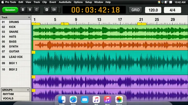
![[Format]
Landscape 16:9 gig cover, full-bleed screenshot of an audio-workstation session. Pixel-crisp flat interface rendering, screenshot aesthetic, no photography and no lighting. No watermark, no personal names.
[Layout]
The entire canvas is one digital-audio-workstation window captured edge to edge, with a thin macOS menu bar across the very top and a translucent Dock strip across the very bottom. The window divides into four nested regions: a transport toolbar across its top, holding a small green session chip at the left, transport buttons, a black time-count readout with large amber digits just right of centre and two small numeric fields further right; a pale-grey track-list column down the left fifth, holding group headings, a long scroll of small track names and a short groups box at its foot; a wide edit area filling the remaining four-fifths with stacked horizontal track lanes in teal, green, orange, purple and salmon, each with a compact header chip on its left edge and a coloured waveform or cluster of MIDI note blocks drawn inside; and a thin ruler strip across the top of the edit area with bar numbers and small yellow memory-location markers. The lower half of the edit area is dominated by a wide teal waveform lane above two purple vocal lanes filled with dense repeated waveform spikes. Depth is purely two-dimensional UI layering — panels, headers and lanes flat on the same plane.
[Subject]
None — interface only; no human figure and no display type composited over the image.
[Headline]
Nothing is layered over the screenshot; all text is native interface text inside it. The macOS menu bar's far-left item is the application name "Pro Tools" beside the Apple glyph, followed by a row of small menu words, with system icons and a clock at the top-right. Within the window, tiny track names, track numbers, time values and a tool label sit as small system type along the left column and the transport strip rather than as display typography.
[Badges]
The Apple logo appears as a small dark apple glyph at the extreme top-left of the menu bar, with the "Pro Tools" application-menu wordmark immediately to its right. Along the bottom edge a translucent Dock strip holds a row of rounded-square application tiles in blue, green, orange, yellow and red with tiny labels beneath them.
[Mood]
Pale interface grey, teal, purple, orange and salmon, with a black transport bar and amber digits. Technical, dense and authentic-engineer. At thumbnail size it reads unmistakably as a full-bleed Pro Tools session screenshot with a dark menu bar on top and a Dock strip along the bottom.](https://files.posterlet.com/assets/generated/md/0meqwctg5nnn.webp)
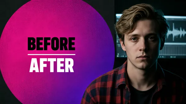
![[Format]
Landscape 16:9 gig cover, editorial before/after comparison composite. Grainy matte texture, low-key moody photography with a flat graphic overlay. No watermark, no personal names.
[Layout]
A hard vertical division sits around the two-thirds mark: the left zone is a huge magenta-to-violet disc with heavy noise grain, its circular edge cropped by the top, left and bottom edges of the frame so it reads as a large soft-edged slab rather than a full circle; the right zone is a dark studio interior where a dim monitor shows a grey waveform editor behind the subject's head. The disc sits flat on the dark background, its right arc tucked behind the subject's shoulder, leaving the disc interior clean so the type stays fully legible. All headline content is centred inside the disc on the left, around the vertical middle, with a wide margin from the circle edge. The lower-right corner falls away into near-black, deepening the split.
[Subject]
A man in his early twenties with wavy light-brown hair parted to one side, clean-shaven, wearing an open red-and-navy plaid flannel shirt over a darker shirt. Head-and-shoulders, filling the right 40% of the frame and cropped at the right and bottom edges; he looks straight into camera with a neutral, slightly tired expression. Low-key lighting with a cool monitor glow catching his hair from behind-left and deep shadow across the right of his face.
[Headline]
Inside the magenta disc, left-aligned as a small block around the vertical centre: "BEFORE" in a heavy near-black grotesque, all caps, medium size; beneath it a short horizontal white rule; beneath that "AFTER" in the same weight but pure white and set slightly larger.
[Badges]
none.
[Mood]
Magenta, violet, charcoal and muted flannel red. Quiet, documentary and slightly melancholy. At thumbnail size it reads as a big glowing purple disc with two short words beside a shadowed young face on the right.](https://files.posterlet.com/assets/generated/md/8jzjcaqlalq1.webp)
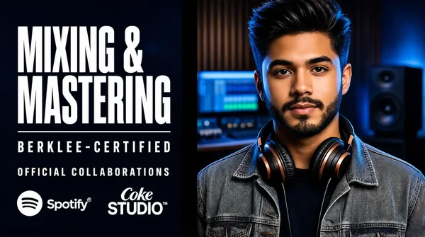
![[Format]
Landscape 16:9 gig cover, dark studio promotional composite. Cool blue-teal grade with warm skin highlights, glossy commercial retouch, soft rim lighting. No watermark, no personal names.
[Layout]
A vertical split at roughly the halfway line: the left half is a layered type-and-logo column on a dark navy blurred studio backdrop, the right half is a large cut-out portrait. The portrait is cropped hard by the right and bottom frame edges so its shoulders bleed off-canvas, and its outline overlaps the dark background slightly at the centre. Behind the portrait, out of focus, sit a blue-lit studio desk with a monitor, a wood-panelled wall and a floor-standing speaker, all thrown into soft bokeh. The left column keeps one common left margin and descends in even steps: two display lines, a thin rule spanning most of the column, a certification line, a kicker line, then a logo row across the bottom of the column. Type never crosses onto the portrait; the small strip of dark background between column and face carries the rule.
[Subject]
A young man in his early twenties with a short dark beard and moustache and dark hair swept upward. Large black over-ear headphones with copper accents rest around his neck. He wears a grey denim jacket over a dark tee, waist-up and angled slightly toward camera, occupying the right 45% of the frame with a calm, direct gaze. Cool blue key light on one side of his face and warm fill on the other, with blue rim light along his shoulders.
[Headline]
Left column, all on a common left margin: "MIXING &" over "MASTERING" in an ultra-bold white condensed grotesque, all caps, two tight lines filling the upper-left and running close to the portrait. Below them a thin white horizontal rule; below that "BERKLEE-CERTIFIED" in widely letter-spaced white uppercase about a third of the display size; below that "OFFICIAL COLLABORATIONS" in a smaller, lighter, still letter-spaced white uppercase.
[Badges]
At the foot of the left column sit two logo lockups on the dark background, both unplated: the Spotify mark — a solid white circle containing three stacked black curved sound-wave bars, about the width of a capital letter — immediately left of the white "Spotify" wordmark carrying a small registered mark; to its right, a two-line white serif wordmark reading "Coke" above a larger "STUDIO", with a tiny trademark glyph.
[Mood]
Navy, black, cobalt and teal-blue with warm skin and crisp white type. Cool, confident and credential-forward. At thumbnail size it reads as a dark blue cover with a big white two-line headline and two small white logos on the left, and a headphone-wearing portrait on the right.](https://files.posterlet.com/assets/generated/md/r49lvae6fbpq.webp)
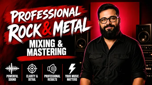
![[Format]
Landscape 16:9 gig cover, bold red-and-black promotional composite. Studio-lit portrait cut-out over a painted brush-textured background, crisp commercial retouch. No watermark, no personal names.
[Layout]
A left-to-right split: a typographic stack occupies the left half and a portrait cut-out occupies the centre-right. The background is a deep red-to-black vertical gradient with a soft red studio panel, blurred speaker cabinets and dim studio gear behind the subject, all held out of focus so the type stays clean. The headline stack is left-aligned in the upper-left, its three groups stepping down and slightly inward toward the centre. A long swept red paint stroke runs beneath the script lines as a divider, and a second shorter stroke sits under the bottom line. Across the lower-left to lower-centre, four equal columns of white outline icons with two-line labels form a single horizontal band about a sixth of the frame height, separated by thin red vertical rules. The band stops before the subject's chest so it never crosses his silhouette.
[Subject]
A man in his thirties with short dark hair, a thick dark beard and black rectangular glasses, wearing a black button-through shirt with two chest pockets and rolled sleeves. Waist-up and centred-right, head in the upper third, turned slightly to camera with a soft closed-mouth smile. Warm key light from the left, magenta-red rim from behind, deep falloff on his right side.
[Headline]
Upper-left, three stepped groups: "PROFESSIONAL" in a white rough brush-script face, tilted a few degrees up to the right and sitting on a red painted slab; beneath it "ROCK & METAL" in the same white brush script at roughly double the size, with the ampersand picked out in red; beneath that "MIXING &" over "MASTERING" in a heavy white condensed grotesque, all caps, set in two lines with tight leading and no plate. A rough hand-painted red stroke underlines the script block and a longer red stroke sweeps beneath the bottom line.
[Badges]
A row of four white line icons, each above a two-line white all-caps label, evenly spaced along the lower-left with thin red vertical rules between them: a waveform glyph over "POWERFUL SOUND"; a target glyph over "CLARITY & DETAIL"; a speaker glyph over "PROFESSIONAL RESULTS"; a lightning-bolt glyph over "YOUR MUSIC MATTERS".
[Mood]
Crimson red, black, white and warm skin tones. Aggressive, high-energy and genre-specific. At thumbnail size it reads as a red slab with big white brush lettering on the left, a bearded figure on the right and a strip of small white icons along the bottom.](https://files.posterlet.com/assets/generated/md/lr5xcl6t04si.webp)
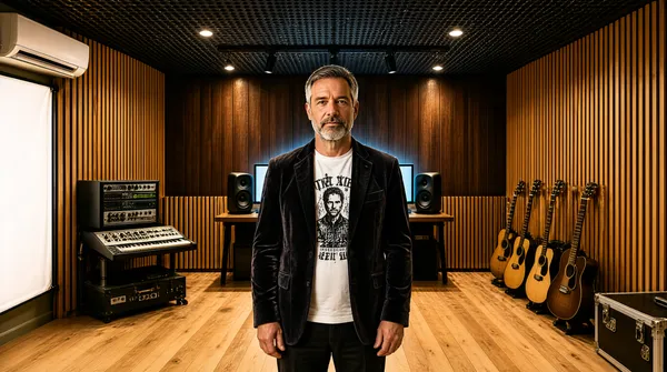
![[Format]
Landscape 16:9 gig cover, warm environmental portrait inside a small recording studio. Photographic realism, soft natural light, medium contrast, no typographic overlay. No watermark, no personal names.
[Layout]
A single full-bleed photograph in symmetrical one-point perspective down a narrow studio room; no text appears anywhere on the canvas. A light timber floor spreads across the bottom third and narrows toward the back wall; wood-panelled side walls carrying vertical slat diffusers flank both edges; a dark perforated acoustic ceiling fills the top band, lit by a black track bar with four small spotlights aimed at the back wall. The back wall itself is a row of dark wood panels above short timber slats. Equipment clusters low and to the sides: a rack of outboard gear and a synthesizer at mid-left, near-field speakers on stands either side of a desktop monitor showing a grey DAW, and on the right a rack of six electric and acoustic guitars leaning in a row beside a black flight case. A large white scrim panel and a wall-mounted air-conditioner occupy the far-left edge. The wide empty floor in the foreground gives the composition its depth, so the figure reads as standing in an open corridor between the panels.
[Subject]
A man in his late forties standing dead-centre, waist-up and slightly below the frame's midpoint. Short greying hair and a trimmed grey beard; he wears a dark charcoal velvet blazer over a white printed graphic tee, hands relaxed at his sides, facing camera with a calm closed-mouth look. He occupies the central third and is lit by a soft warm key from the left with a cool rim from the desk monitor behind him.
[Headline]
none.
[Badges]
none.
[Mood]
Amber, walnut brown, cream and black over a pale warm floor. Calm, considered and craftsman-like. At thumbnail size it reads as a warm wood-slatted studio corridor with a centred figure in a dark jacket.](https://files.posterlet.com/assets/generated/md/u58czxtlkt9r.webp)
![[Format]
Landscape 16:9 gig cover, flat vector music-graphics poster. Glossy 3D-rendered display type with soft outer glow and lens-flare sparkles, hard-edged saturated colour. No watermark, no personal names.
[Layout]
A bright green gradient field, radiant yellow-green behind the centre-left type and blooming outward to deeper emerald at the corners, with a faint white starfield sprinkled over the whole frame. The centre holds a tight typographic stack sitting just above the vertical middle: a very tall narrow first word at the left of the stack, two small stacked words tucked against its upper right shoulder, a wider line beneath them, then a small centred all-caps line. Low-poly faceted paper-like triangles and shards — some lime, some dark green — tumble in from every corner, largest at the top-centre, top-left, bottom-right and bottom-left, radiating outward and running off the frame edges so they overlap the background only and never the type. A row of flat black speaker cabinets lies along the bottom-left: three boxes at the leftmost edge and a taller pair to their right, with small black music notes and quavers floating in the gap between them. A small green-and-black flag pennant with a yellow diagonal saltire cross is centred directly beneath the bottom headline line at roughly a tenth of the frame width.
[Subject]
None — typographic and graphic elements only.
[Headline]
All type centred in the middle-left of the frame, white with a soft grey-green glow and a thin dark edge: the word "MIX" in an ultra-condensed very tall white caps, the largest element, paired at its right shoulder with "YOUR" over "SONGS" in two small lines of medium white caps; beneath them "& MASTER" in the same ultra-condensed white caps but wider and lower, its ampersand slightly smaller and raised; then, centred under that, "DANCEHALL & REGGAE" in a smaller white caps with a pale gradient sheen sweeping across the letters. Nothing sits on a plate; all type floats over the green.
[Badges]
none.
[Mood]
Vivid emerald, lime, white and black accents. Loud, festive, tropical-club energy. At thumbnail size it reads as a bright green poster with glowing white stacked type, black speakers along the bottom-left and green shards tumbling through the corners.](https://files.posterlet.com/assets/generated/md/hdsfgkmxuqv9.webp)