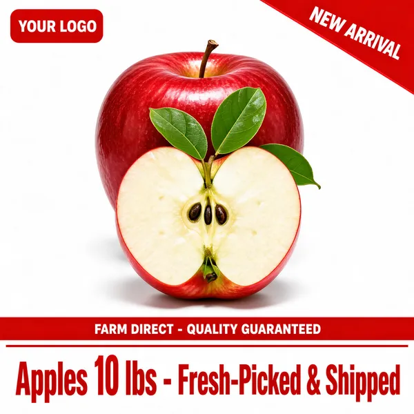
About this collection
A product main image has one job: survive the search grid. On Amazon, eBay, Etsy, Shopify, Walmart, or TikTok Shop, a shopper sees your listing as a thumbnail between a dozen near-identical competitors, and decides in a second whether to click. This collection — more than 1,800 generated hero shots — is built for that moment. The layouts follow how marketplace listings are merchandised: the product front and centre on a clean stage, a short headline, a price or offer, and two or three claim badges doing the rest.
The source layouts borrow from Chinese e-commerce merchandising — bold price digits, check-marked claims, guarantee bands along the bottom edge — with all copy translated into English and prices rendered in dollars. Categories span food and snacks, skincare and beauty, electronics, apparel, home appliances, pet supplies, and seasonal sale banners, so there is usually a starting point close to your product. The collection mixes styled lifestyle shots with clean white-background packshots, so you can match the look your listing needs.
Nothing here is a layered design file. Each image is flat and generated, which is exactly what makes it fast: find the layout that matches your product and claim, treat it as a visual brief, and swap in your own headline, price, and badges.
What a product main image has to do
The grid shrinks everything, so the rules are strict:
- The product identifiable before reading a word. A bottle, a box, a device — the category should register as a shape before the headline resolves.
- One offer, plainly priced. "$29.99" or "Buy 2 Get 1 Free" reads at thumbnail size. Three stacked promotions turn into grey noise.
- Three to six words in the headline. Small type is the first casualty of shrinking, and long headlines guarantee small type.
- Claims with check marks, not paragraphs. "50H Battery Life" survives the grid; a sentence about engineering does not.
Where text-heavy main images are allowed
This matters before you upload. Amazon prohibits text, logos, and badges on the main image of most product listings — there, use these layouts as secondary images, A+ content, or brand-story tiles instead. Marketplaces and channels that allow rich main images — eBay, Etsy, Shopify storefronts, TikTok Shop, and most social commerce — are where these designs work as-is. Check your channel's current policy; it is enforced inconsistently but the listings that get pulled are always the seller's problem.
Resizing and export
Marketplaces differ on what they accept, and the requirements change — Amazon, for instance, needs enough resolution on the longest side to power image zoom, while smaller channels are happy with far less. Check your channel's current requirements before uploading, and always scale down from the download rather than upscaling: upscaling softens the type edges, and soft type is exactly what a thumbnail cannot afford.
Common questions
Are the prices and offers real?
No. Every dollar figure, discount claim, warranty band, and "free gift" badge is an illustrative placeholder chosen to make the layout look right. Replace them with your own real offer before publishing — a fake price in a live listing is a refund-and-complaint generator, not a shortcut.
Can I edit the text or the price after generating?
Not in place. The text is rendered into the image, so there is no text layer underneath. Download the file and edit it in your own image editor, or use the "Use as Template" option to regenerate the layout from a new brief.
Will these fit my marketplace's listing rules?
That is on the channel, not the file. Marketplaces differ on what they accept, on minimum image quality and on whether text is allowed at all, so check your channel's requirements before uploading. Scaling the download down is safe; scaling up is not.
Which marketplaces allow text on the main image?
Amazon does not, for most categories. eBay, Etsy, and Shopify storefronts are generally fine with it, and TikTok Shop and social commerce expect it. Rules change, so confirm for your category before relying on a text-heavy main image.
How do I pick a layout?
Match two things: your product category, and the one claim you lead with. A price-led layout ("$XX.XX" in huge digits) fits commodity goods; a benefit-led layout (one bold promise, two check-marked sub-claims) fits skincare, supplements, and electronics; a festival banner fits timed promotions. If the layout's claim type differs from yours, the design will fight your copy.