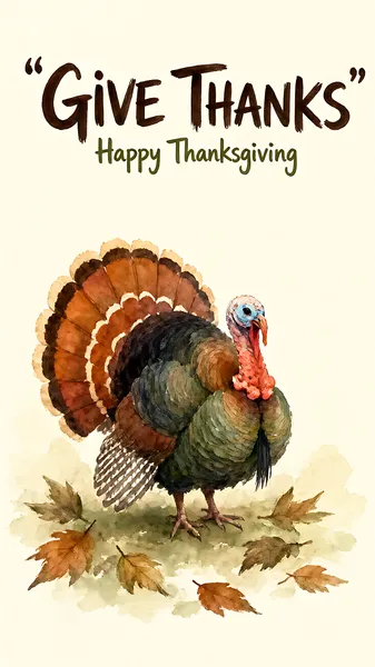
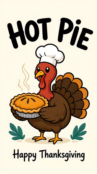
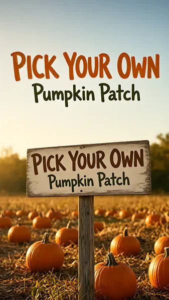

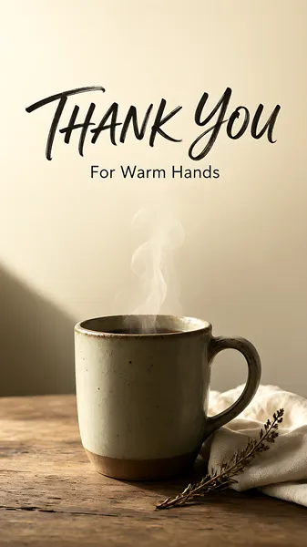







About Thanksgiving poster designs
Thanksgiving artwork usually fails in one of two ways: a lovely illustration with nowhere to put the opening hours, or a wall of orange with a turkey pasted in the corner. These designs keep the seasonal warmth in the background and reserve a clean block for the message you actually need to deliver - an offer, a menu, a reservation, an order cut-off.
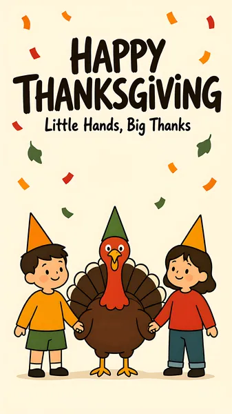
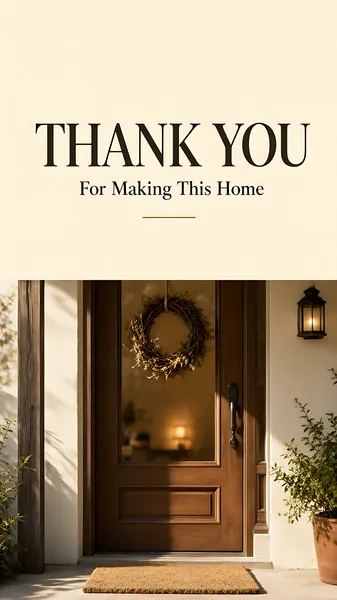
The collection answers three jobs, and they do not share a layout. The offer: a shop, salon, bakery, restaurant or online store running a thank-you promotion - a threshold discount, a coupon, a gift with purchase, a membership top-up, a window that closes on the Sunday. The occasion: a fixed menu, seating times, a potluck, a service, a venue booking. The thanks: a lettering or still-life piece a brand sends to customers, clients or staff, with no call to action at all.
Retail is a bigger part of this gallery than the dinner imagery suggests - sale, coupon, gift-with-purchase, membership and client-appreciation pieces are about a fifth of it - and a sale poster is a different design problem from a dinner invitation. It gets its own section below.
Nothing here is composed for a national campaign. A printed sheet in the window and a post in the feed is the scale these are drawn for.
The offer: how a thank-you sale poster works
A shopper reads a sale poster in the order they care about: the number, the condition, the deadline, then who is speaking. Six rules cover most of it.
- One hero number. The headline discount or the entry threshold, set at three to four times the body size. Two numbers fighting at the same weight means neither gets read.
- Thresholds stack, but three lines at most. "Spend 50, save 5" over three tiers reads as a ladder; five tiers read as a spreadsheet and stop being scannable.
- A coupon shows its value, not its rules. The amount is the graphic; the conditions go in one small line underneath it.
- A gift with purchase needs a picture of the gift. The object is what converts - a gift box, a tote, a set of minis - and it belongs at the same visual level as the offer text, not tucked in a corner.
- Membership and top-up offers live on arithmetic. "Pay 300, get 350" works when both numbers are large and adjacent; the tiers beneath are support, never the headline.
- Give the deadline a date. "Ends Sunday 29 November" outperforms "limited time" and gives the layout a natural corner to sit in.
Keep the terms line inside the safe area at half the body weight. It is read by the people who have already decided to buy, and it is the first thing to be cropped off an edge. The logo stays small: this is a message from the shop, not a brand campaign.
The occasion: what the poster has to say
When the design is an invitation or a menu rather than an offer, four lines do most of the work. Group them low on the poster:
- What - "Thanksgiving dinner", "Harvest supper", "Friendsgiving"
- When - date and time, with the day of the week spelled out
- Where - venue plus a short address
- How much, or how to book - price per head, a phone number, a booking deadline
If the menu is the point, list three or four dishes rather than all of them. A full menu at poster scale becomes texture instead of information. For a shop rather than a venue, the same block becomes opening hours, the address, and whether the offer runs in store, online, or both.
Autumn palette notes
- Cream or off-white ground keeps food photography appetising; pure white turns roast tones grey.
- Rust, ochre and burnt orange carry the season without arriving at red-and-green a month early.
- Deep red with gold is the sale register - it is what shoppers already read as "price event" - and it stays short of Christmas as long as the green stays out.
- Blush and pearl suit salon and skincare offers, where the palette does the gift work that a product shot does elsewhere.
- Deep green velvet with gold reads premium: right for a membership or top-up card, wrong for a pumpkin-pie discount.
- Deep brown type is warmer than black at the same weight, and one metallic accent - copper or antique gold - is usually enough.
Common questions
Is this collection only for restaurants and dinner invitations?
No. A large share of the gallery is retail and service: threshold discounts, coupons, gift-with-purchase, membership top-ups, client appreciation and beauty offers. The dinner pieces are the most photographed; the sale pieces are the ones most often put to work.
How many prices can one sale poster carry?
One hero figure, plus up to three supporting tiers. Past that the reader stops comparing and starts adding, which is not what the layout wants them to do in the two seconds it gets.
Can a Thanksgiving poster promote a Black Friday sale?
It can, but keep the two messages apart. "Closed Thanksgiving, open 6 am Friday" works as one poster; a discount burst stacked on top of a dinner invitation reads as two competing designs.
What colors work for Thanksgiving?
Cream, rust, ochre, deep brown and a single copper accent for the seasonal register; deep red with gold for a sale; blush or pearl for salon and skincare; deep green with gold for a premium membership offer. Avoid pairing red with green - it reads a month early.
Which layout fits a feed post, and which a story?
Feed: the self-contained layout, where the whole design has to read in one glance. Story: the full-screen arrangement, built so the greeting sits above the middle and the details below it. The collection mixes both, so check the individual image rather than assuming a crop.
Do these work for Friendsgiving or a church supper?
Yes. Regenerate with a plainer greeting and a potluck or service-time block instead of a prix fixe menu.
Should the menu be on the poster?
Only if it is short. Three or four dishes at large type; a full menu belongs on a card or a page, with the poster pointing to it.