

About Thanksgiving poster designs
Thanksgiving artwork usually fails in one of two ways: a lovely illustration with nowhere to put the opening hours, or a wall of orange with a turkey pasted in the corner. These designs keep the seasonal warmth in the background and reserve a clean block for the message you actually need to deliver - an offer, a menu, a reservation, an order cut-off.
The collection answers three jobs, and they do not share a layout. The offer: a shop, salon, bakery, restaurant or online store running a thank-you promotion - a threshold discount, a coupon, a gift with purchase, a membership top-up, a window that closes on the Sunday. The occasion: a fixed menu, seating times, a potluck, a service, a venue booking. The thanks: a lettering or still-life piece a brand sends to customers, clients or staff, with no call to action at all.
Retail is a bigger part of this gallery than the dinner imagery suggests - sale, coupon, gift-with-purchase, membership and client-appreciation pieces are about a fifth of it - and a sale poster is a different design problem from a dinner invitation. It gets its own section below.
Nothing here is composed for a national campaign. A printed sheet in the window and a post in the feed is the scale these are drawn for.
The offer: how a thank-you sale poster works
A shopper reads a sale poster in the order they care about: the number, the condition, the deadline, then who is speaking. Six rules cover most of it.
- One hero number. The headline discount or the entry threshold, set at three to four times the body size. Two numbers fighting at the same weight means neither gets read.
- Thresholds stack, but three lines at most. "Spend 50, save 5" over three tiers reads as a ladder; five tiers read as a spreadsheet and stop being scannable.
- A coupon shows its value, not its rules. The amount is the graphic; the conditions go in one small line underneath it.
- A gift with purchase needs a picture of the gift. The object is what converts - a gift box, a tote, a set of minis - and it belongs at the same visual level as the offer text, not tucked in a corner.
- Membership and top-up offers live on arithmetic. "Pay 300, get 350" works when both numbers are large and adjacent; the tiers beneath are support, never the headline.
- Give the deadline a date. "Ends Sunday 29 November" outperforms "limited time" and gives the layout a natural corner to sit in.
Keep the terms line inside the safe area at half the body weight. It is read by the people who have already decided to buy, and it is the first thing to be cropped off an edge. The logo stays small: this is a message from the shop, not a brand campaign.
The occasion: what the poster has to say
When the design is an invitation or a menu rather than an offer, four lines do most of the work. Group them low on the poster:
- What - "Thanksgiving dinner", "Harvest supper", "Friendsgiving"
- When - date and time, with the day of the week spelled out
- Where - venue plus a short address
- How much, or how to book - price per head, a phone number, a booking deadline
If the menu is the point, list three or four dishes rather than all of them. A full menu at poster scale becomes texture instead of information. For a shop rather than a venue, the same block becomes opening hours, the address, and whether the offer runs in store, online, or both.
Autumn palette notes
- Cream or off-white ground keeps food photography appetising; pure white turns roast tones grey.
- Rust, ochre and burnt orange carry the season without arriving at red-and-green a month early.
- Deep red with gold is the sale register - it is what shoppers already read as "price event" - and it stays short of Christmas as long as the green stays out.
- Blush and pearl suit salon and skincare offers, where the palette does the gift work that a product shot does elsewhere.
- Deep green velvet with gold reads premium: right for a membership or top-up card, wrong for a pumpkin-pie discount.
- Deep brown type is warmer than black at the same weight, and one metallic accent - copper or antique gold - is usually enough.
Common questions
Is this collection only for restaurants and dinner invitations?
No. A large share of the gallery is retail and service: threshold discounts, coupons, gift-with-purchase, membership top-ups, client appreciation and beauty offers. The dinner pieces are the most photographed; the sale pieces are the ones most often put to work.
How many prices can one sale poster carry?
One hero figure, plus up to three supporting tiers. Past that the reader stops comparing and starts adding, which is not what the layout wants them to do in the two seconds it gets.
Can a Thanksgiving poster promote a Black Friday sale?
It can, but keep the two messages apart. "Closed Thanksgiving, open 6 am Friday" works as one poster; a discount burst stacked on top of a dinner invitation reads as two competing designs.
What colors work for Thanksgiving?
Cream, rust, ochre, deep brown and a single copper accent for the seasonal register; deep red with gold for a sale; blush or pearl for salon and skincare; deep green with gold for a premium membership offer. Avoid pairing red with green - it reads a month early.
Which layout fits a feed post, and which a story?
Feed: the self-contained layout, where the whole design has to read in one glance. Story: the full-screen arrangement, built so the greeting sits above the middle and the details below it. The collection mixes both, so check the individual image rather than assuming a crop.
Do these work for Friendsgiving or a church supper?
Yes. Regenerate with a plainer greeting and a potluck or service-time block instead of a prix fixe menu.
Should the menu be on the poster?
Only if it is short. Three or four dishes at large type; a full menu belongs on a card or a page, with the poster pointing to it.
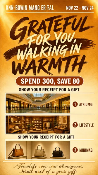
![A mall-wide Thanksgiving promotion laid out as a vertical poster bathed in warm amber light. [Colors] amber #E08A3C, burnt sienna #B4622C, cream #FBF0E1, caramel #8A4A1E, gold #E8B96A. [Layout] brand row at the top with a date stamp opposite; dry-brush calligraphy filling the upper quarter in two stacked sweeps, crossed by a script overlay; a two-part pill label beneath; three numbered sections below, each with a small caps tag at the right margin, one or two inset photographs of store interiors and a centred benefit line; a thin rule and a closing couplet at the base. [Typography] sweeping brush display calligraphy, a light script overlay, wide-tracked caps for section tags, bold sans for the benefit copy, small circled numerals. [Subject] inset photographs of a mall atrium with glass balustrades and lit shop fronts, a warm lifestyle store, and a minimal handbag boutique. [Lighting & mood] late-afternoon gold, inviting retail warmth. [Details] soft light-leak in the top corners, thin white rules, warm grain. Text: "GRATEFUL FOR YOU, WALKING IN WARMTH", "NOV 22 – NOV 24", "SPEND 300, SAVE 80", "SHOW YOUR RECEIPT FOR A GIFT". Every line of text must be real, correctly spelled English - no placeholder, no lorem ipsum, no gibberish, no phone numbers, no email addresses, no QR codes, no bracketed placeholders.](https://files.posterlet.com/assets/generated/md/gw2u6ce33k61.webp)
![A scarlet e-commerce promotion anchored on an opened red envelope, built as a vertical poster with a glossy commercial finish. [Colors] vermilion #D8321E, tangerine #F07A2B, cherry #E0231B, cream #FBEDD8, lime #A8D22C. [Layout] a script wordmark across the top third over a lime highlight ribbon; two stacked heavy headline lines beneath; the envelope opens at mid-frame, a cream card sliding out with a faceted ruby heart resting on it; confetti bokeh fills both edges; a white rounded panel at 72% holds two numbered benefit rows and a three-coupon strip; a widely spaced closing line at the base. [Typography] flowing brush script, ultra-bold italic display for the headline, small rounded numerals for the counters, condensed bold figures with tiny unit lines under each coupon. [Subject] textured red envelope with visible paper fibre, glossy gem heart, scattered sequin light. [Lighting & mood] festive, high-key, celebratory warmth. [Details] star flares, sparkle grains, coupon notch shapes, thin white rules. Text: "THANKSGIVING", "THANKSGIVING REWARDS", "SPEND 299, SAVE 30", "SPEND 699, SAVE 90". Every line of text must be real, correctly spelled English - no placeholder, no lorem ipsum, no gibberish, no phone numbers, no email addresses, no QR codes, no bracketed placeholders.](https://files.posterlet.com/assets/generated/md/ma14isg3ajvn.webp)
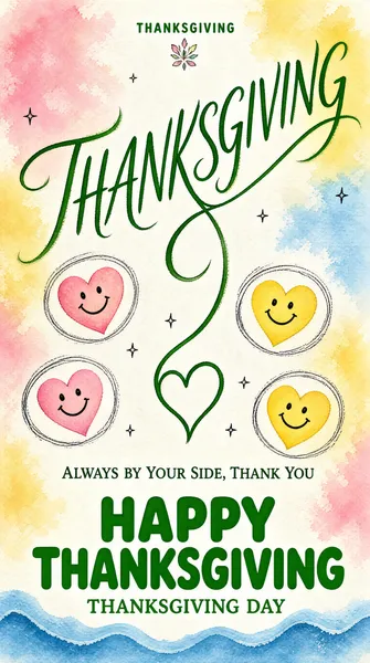
![A soft-focus pastel greeting card turned vertical poster, painted in loose watercolour washes. [Colors] sherbet pink #F9C8CE, butter yellow #F8E39B, powder blue #BFD9EC, leaf green #3E8B4A, cream #FDFAF2. [Layout] a tiny brand mark centred at the very top; an open field of blurred colour; a large green script word sweeping diagonally through the upper half, its long tail looping down into a drawn heart at centre; four smiley hearts with sketched ring halos floating around the mid-band; the blessing line centred at 72%; a heavy green title at 80% with a lowercase English line under it; a blue wave closing the bottom edge. [Typography] fluid calligraphic script with needlepoint thin strokes, light serif for the small line, rounded extra-bold sans for the closing greeting. [Subject] hand-drawn smiley hearts in pink, yellow and blue with pencil halos and sparkle ticks. [Lighting & mood] airy, sunlit, gentle and childlike. [Details] chalky paper grain, pigment blooming at the edges, tiny four-point stars, feathery brush ends. Text: "THANKSGIVING", "ALWAYS BY YOUR SIDE, THANK YOU", "HAPPY THANKSGIVING", "THANKSGIVING DAY". Every line of text must be real, correctly spelled English - no placeholder, no lorem ipsum, no gibberish, no phone numbers, no email addresses, no QR codes, no bracketed placeholders.](https://files.posterlet.com/assets/generated/md/wo0xhxp1n33z.webp)
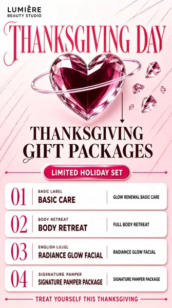
![A beauty-salon Thanksgiving package menu, arranged as a vertical poster with a glossy 3D still-life finish. [Colors] candy pink #F5739C, rose #E8447A, pale blush #FDE7EE, pearl white #FFF7FA, deep berry #8E1E44. [Layout] brand lockup top left; an oversized serif wordmark spanning the upper third behind a suspended crystal heart; a two-line title block centred beneath it; a rounded pill label; four white service cards stacked from 55% to 92% height, each with a big two-digit numeral in the left margin, a small English label over a bold service name, and an itemised line at the right; a thin closing rule. [Typography] high-contrast fashion serif for the English title, rounded bold sans for the service names, thin stencil numerals in rose, wide-tracked micro caps. [Subject] blown-glass heart with a candy-red core and a translucent orbit ring, smaller crystal shards drifting around it. [Lighting & mood] glossy studio gradient, cosmetic-advertisement sheen. [Details] pearl highlight dots, soft bloom on the glass edge, thin magenta rules, faint diagonal pencil strokes. Text: "THANKSGIVING DAY", "THANKSGIVING GIFT PACKAGES", "GLOW RENEWAL BASIC CARE", "FULL BODY RETREAT". Every line of text must be real, correctly spelled English - no placeholder, no lorem ipsum, no gibberish, no phone numbers, no email addresses, no QR codes, no bracketed placeholders.](https://files.posterlet.com/assets/generated/md/ki6d2ht8koe7.webp)
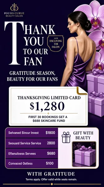
![Beauty-salon gratitude offer built from a purple envelope card (luxury print finish). [Colors] deep violet #3E2358, plum #5B2E7A, orchid #8B5BA8, soft lilac #E8DCF2, pearl white #FBF8FD. [Layout] a logo lockup top-left; a giant white serif English title with an oversized initial fills the upper third beside an outlined badge; two centred display lines follow; a white envelope-shaped card holds the price and the limited-seat line, with a corner tab; a rounded panel lists four purple service bars with right-aligned values, then a benefit block with a gift icon and inset photo; a closing line, legal note and thin rule finish the base. [Typography] couture serif English caps, light display, thin sans for the service list, small italic for the legal note. [Subject] a white / Caucasian woman with dark hair in a low bun, bare shoulders and a purple satin slip dress, turned away in profile among giant orchid petals, lilac gift boxes beside her. [Lighting & mood] soft directional glamour light, silky sheen, exclusive. [Details] ribbon folds, satin highlights, envelope crease, fine gold rules. Text: "THANK YOU TO OUR FAN", "GRATITUDE SEASON, BEAUTY FOR OUR FANS", "THANKSGIVING LIMITED CARD $1,280", "FIRST 30 BOOKINGS GET A $688 SKINCARE FUND". Every line of text must be real, correctly spelled English - no placeholder, no lorem ipsum, no gibberish, no phone numbers, no email addresses, no QR codes, no bracketed placeholders.](https://files.posterlet.com/assets/generated/md/vmvca6tczc9p.webp)
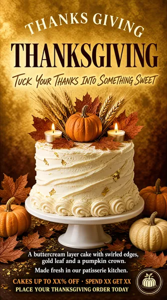
![Patisserie promotion built around a buttercream cake (editorial food photography finish). [Colors] warm ivory #F5EAD8, honey gold #D9B06A, pumpkin orange #E07A2C, deep chestnut #4A2E1B, cream white #FBF6EC, dried-leaf rust #A9502F. [Layout] an arched letterspaced English line curves over the top; a huge high-contrast serif headline sits beneath it; one handwritten-style sentence follows; the cake on a white stand fills the centre with props around its base; two small caption lines and a template offer line stack below; a small round logo mark closes the base. [Typography] expressive high-contrast serif with flared terminals, thin serif English caps curved on an arc, small serif display support copy. [Subject] a tall white buttercream cake with swirled edges and gold leaf flakes, crowned by a miniature orange pumpkin, dried wheat sheaves, rust maple leaves and two lit tea candles; baby pumpkins, scattered leaves and gold dust on the surface around it. [Lighting & mood] soft warm studio light, shallow depth of field, appetising and calm. [Details] piped rosettes at the base, gold flecks, crumb texture, mottled gold backdrop. Text: "THANKS GIVING", "THANKSGIVING", "TUCK YOUR THANKS INTO SOMETHING SWEET", "CAKES UP TO XX% OFF · SPEND XX GET XX". Every line of text must be real, correctly spelled English - no placeholder, no lorem ipsum, no gibberish, no phone numbers, no email addresses, no QR codes, no bracketed placeholders.](https://files.posterlet.com/assets/generated/md/yajip8shpv8l.webp)
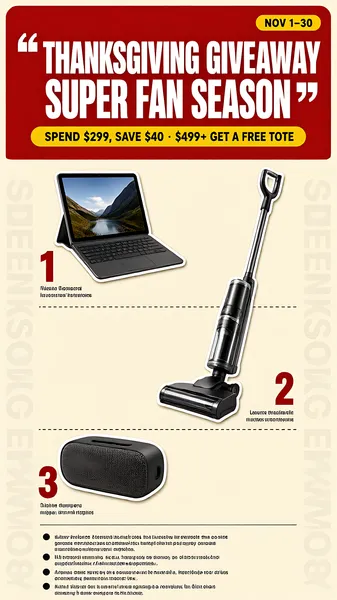
![Red-and-cream giveaway poster stacked as a prize ladder (retail promo finish). [Colors] signal red #E4352F, vintage cream #F3EBDC, mustard #F5C518, deep charcoal #2A2A2A, soft blue #5B8FD6. [Layout] a rounded red header block holds a yellow date pill at the top right and a two-line white headline with quote marks, plus a yellow action pill; a ghosted vertical English word runs down both edges of the cream body; three prize rows alternate image left and right with dashed dividers, each with a red ranking label and a small caption; a four-bullet rule block with round markers fills the lower third beside a thin rule. [Typography] ultra-bold condensed display headline, small bold sans captions, tiny fine-print rules. [Subject] a tablet with a detachable keyboard on a stand, a cordless stick vacuum and a rounded portable Bluetooth speaker, all cut out with soft shadows. [Lighting & mood] flat commercial cut-out lighting, high-contrast, urgent. [Details] dashes, rounded pills, paper speckle, ghosted type. Text: "THANKSGIVING GIVEAWAY", "SUPER FAN SEASON", "NOV 1–30", "SPEND $299, SAVE $40 · $499+ GET A FREE TOTE". Every line of text must be real, correctly spelled English - no placeholder, no lorem ipsum, no gibberish, no phone numbers, no email addresses, no QR codes, no bracketed placeholders.](https://files.posterlet.com/assets/generated/md/ckqmrr49lizr.webp)
![Starry-night lantern greeting poster over still water (cinematic night render). [Colors] midnight navy #0D1B3E, deep indigo #1B2E5E, warm amber #F0A33F, harvest gold #D98E3C, maple red #B03A28, moonlight cream #F5E7C8. [Layout] gold brush calligraphy dominates the top quarter with a heart flourish; a small letterspaced English line sits beneath it; two stacked greeting lines follow, then a two-line verse; a hanging heart-shaped wreath lantern occupies the centre; a moon sits low-left above mountain silhouettes and a lit village shoreline; floating lotus lanterns drift across the lower third with long reflections; a thin bottom rule and thin rule close the base. [Typography] expressive gold brush script for the headline, thin gold serif for the support copy, wide-tracked small caps for the English line. [Subject] a woven twig heart lantern glowing amber, dressed with red and orange maple leaves, white blossoms, berries and a pinecone, tied with a deep burgundy sheer bow and a red tassel. [Lighting & mood] cold blue night against warm lantern light, hushed and reverent. [Details] star field, water ripples, lens-bloom highlights. Text: "THANKSGIVING DAY", "GRATEFUL WE MET, WARMTH ALWAYS", "WITH YOU, EVERY DAY IS THE WARMEST GIFT",. Every line of text must be real, correctly spelled English - no placeholder, no lorem ipsum, no gibberish, no phone numbers, no email addresses, no QR codes, no bracketed placeholders.](https://files.posterlet.com/assets/generated/md/mfteaf8udqts.webp)
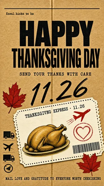
![Kraft-paper postal concept poster about sending thanks (printed ephemera finish). [Colors] kraft brown #C79A63, ink black #231C16, paper white #F6F0E4, postal red #C8402F, ochre #D9973F. [Layout] a faint vertical fold seam splits the sheet; a small English greeting sits under a hairline at the top left; a four-character headline is stacked in two very heavy lines; a letterspaced bilingual line follows; a huge handwritten date sweeps diagonally across the middle; a rotated boarding-pass card fills the lower half with perforated heart edges, a red plane glyph, barcode rules, handwritten field labels and a roast turkey vignette; three shipping pictograms stack at the bottom left; one closing sentence anchors the base. [Typography] heavy grotesque display for the headline, brushed marker numerals for the date, small typewriter-style English inside the card. [Subject] the ticket-shaped greeting card with a stamped heart postmark, red maple leaves and a plated roast turkey. [Lighting & mood] flat daylight scan, tactile and nostalgic. [Details] dotted perforation, cardboard grain, stamp texture. Text: "HAPPY THANKSGIVING DAY", "SEND YOUR THANKS WITH CARE", "THANKSGIVING EXPRESS · 11.26", "MAIL LOVE AND GRATITUDE TO EVERYONE WORTH CHERISHING". Every line of text must be real, correctly spelled English - no placeholder, no lorem ipsum, no gibberish, no phone numbers, no email addresses, no QR codes, no bracketed placeholders.](https://files.posterlet.com/assets/generated/md/l0nqn08cb1w4.webp)
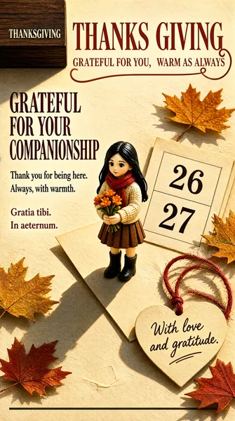
![Warm paper desk still life with a miniature figure at its centre (3D miniature finish). [Colors] bone paper #EFE2CE, rust #A8452F, terracotta #C96A45, walnut #4A2C1D, leaf yellow #E8B14C, dusty red #B5432F. [Layout] a dark walnut block in the top-left corner; a two-line rust serif masthead across the top third with a looped heart swash; bold display greeting, a short couplet and two thin Latin support lines step down the left; a tilted letter and a calendar sheet marked 26 and 27 fill the middle; scattered maple leaves; a paper heart on red twine with handwriting sits lower right A thin rule closes the base. [Typography] high-contrast didone serif, heavy high-contrast serif display, wide-tracked small caps, cursive script on the card. [Subject] a white / Caucasian figurine of a girl with long black hair, cream knit sweater, red scarf, brown pleated skirt and black boots, holding a small bouquet of orange flowers, standing on the letter with a long cast shadow. [Lighting & mood] raking afternoon sun, sharp diagonal shadows, quiet and cosy. [Details] paper fibre, envelope crease, printed calendar numerals. Text: "THANKS GIVING", "GRATEFUL FOR YOU, WARM AS ALWAYS", "GRATEFUL FOR YOUR COMPANIONSHIP", "THANKSGIVING". Every line of text must be real, correctly spelled English - no placeholder, no lorem ipsum, no gibberish, no phone numbers, no email addresses, no QR codes, no bracketed placeholders.](https://files.posterlet.com/assets/generated/md/5tpua4ct0f0t.webp)